

2 distinct styles.
3 stylistic sets each.
For print and screen,
At every scale.
All the sans-serif
You’ll ever need.
3 stylistic sets each.
For print and screen,
At every scale.
All the sans-serif
You’ll ever need.
Expressive
Neutral
Minimal
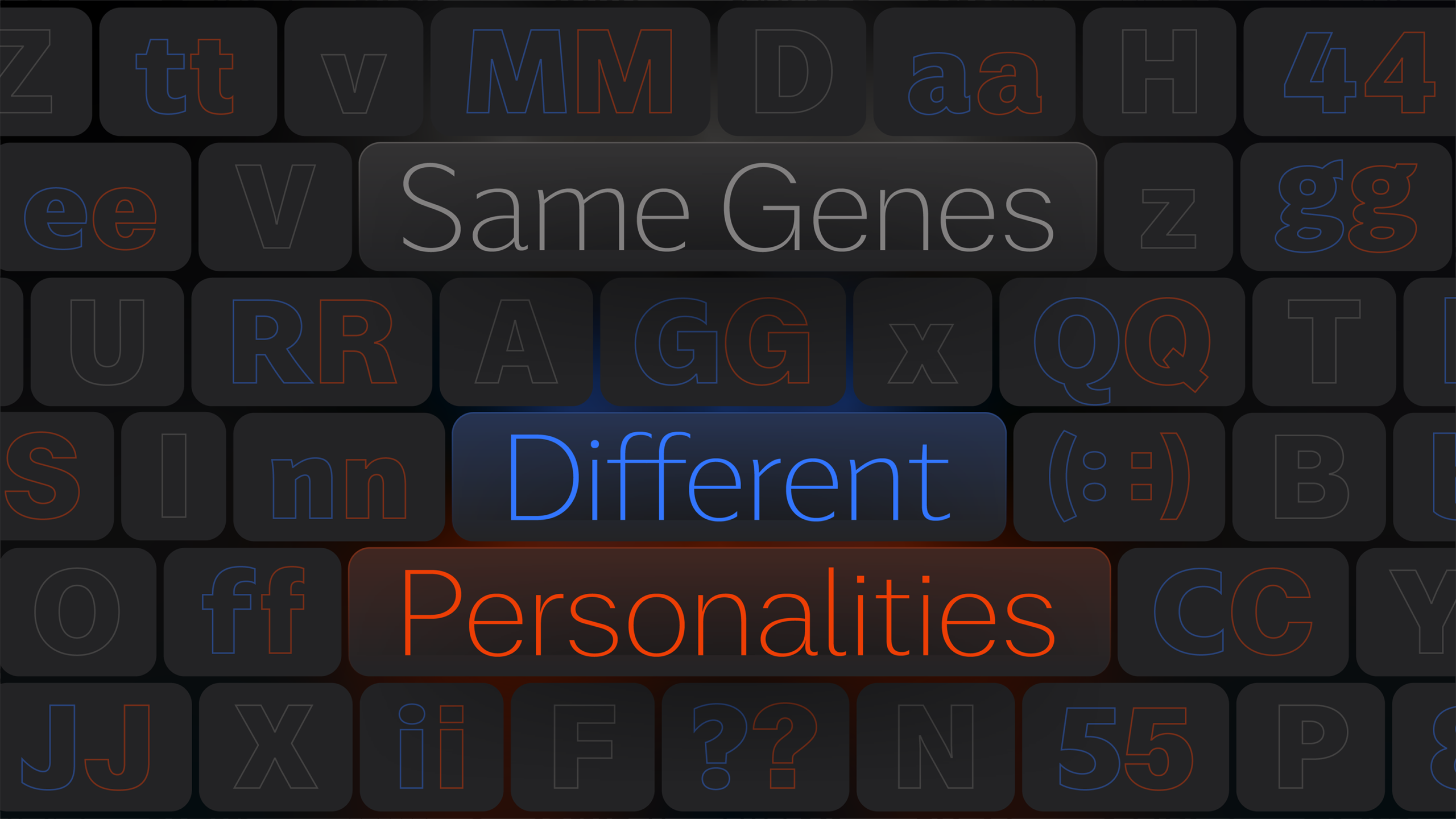
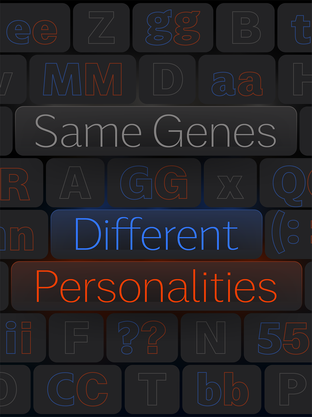
How Are They Similar and How Are They Different?
How Are They Similar and
How Are They Different?
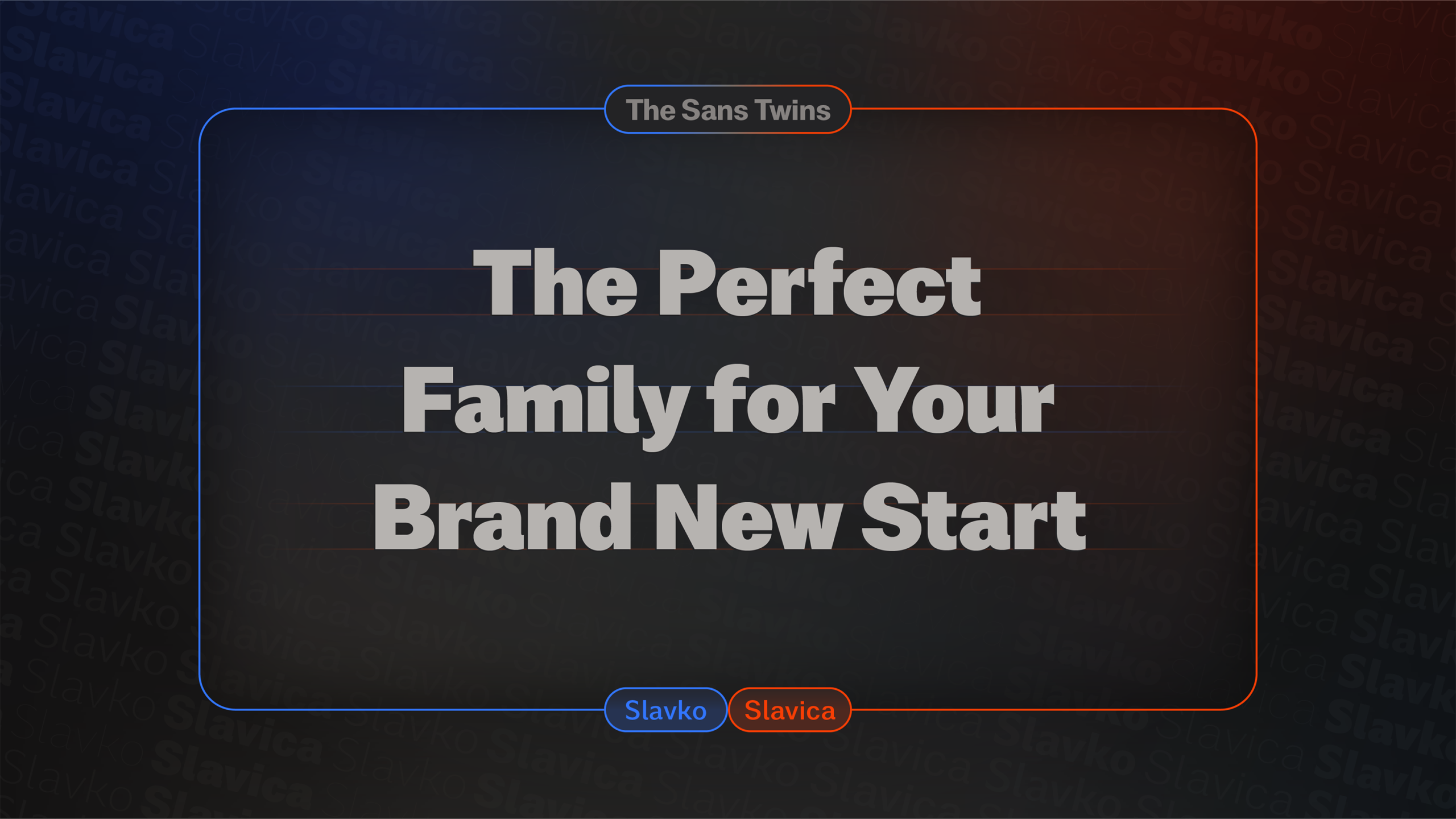
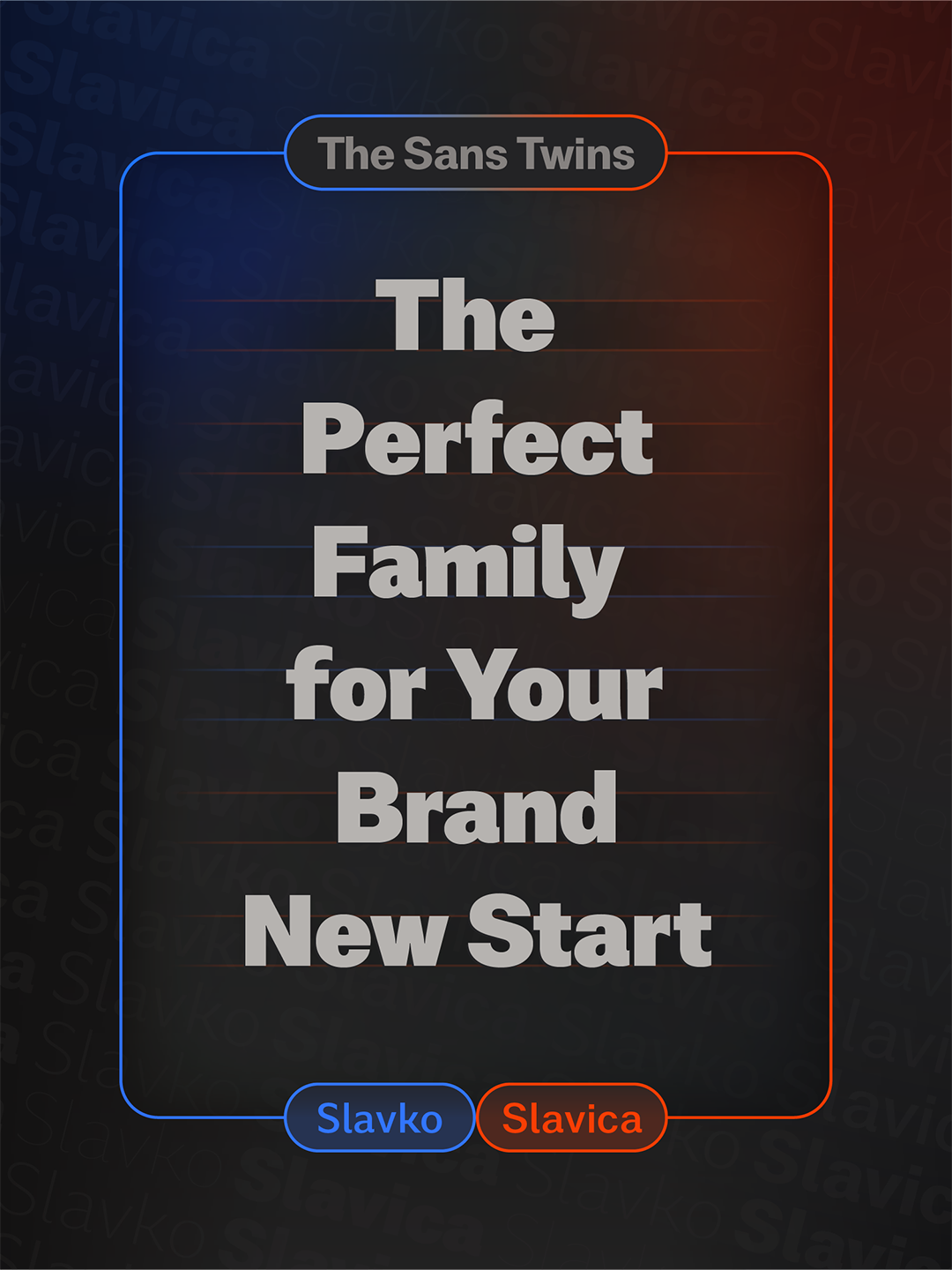
Write Something with the Sans Twins
Write Something
with the Sans Twins
Learn About Letters with the Sans Twins
Learn About Letters
with the Sans Twins
Sans Twins Weights Overview
Sans Twins
Weights Overview
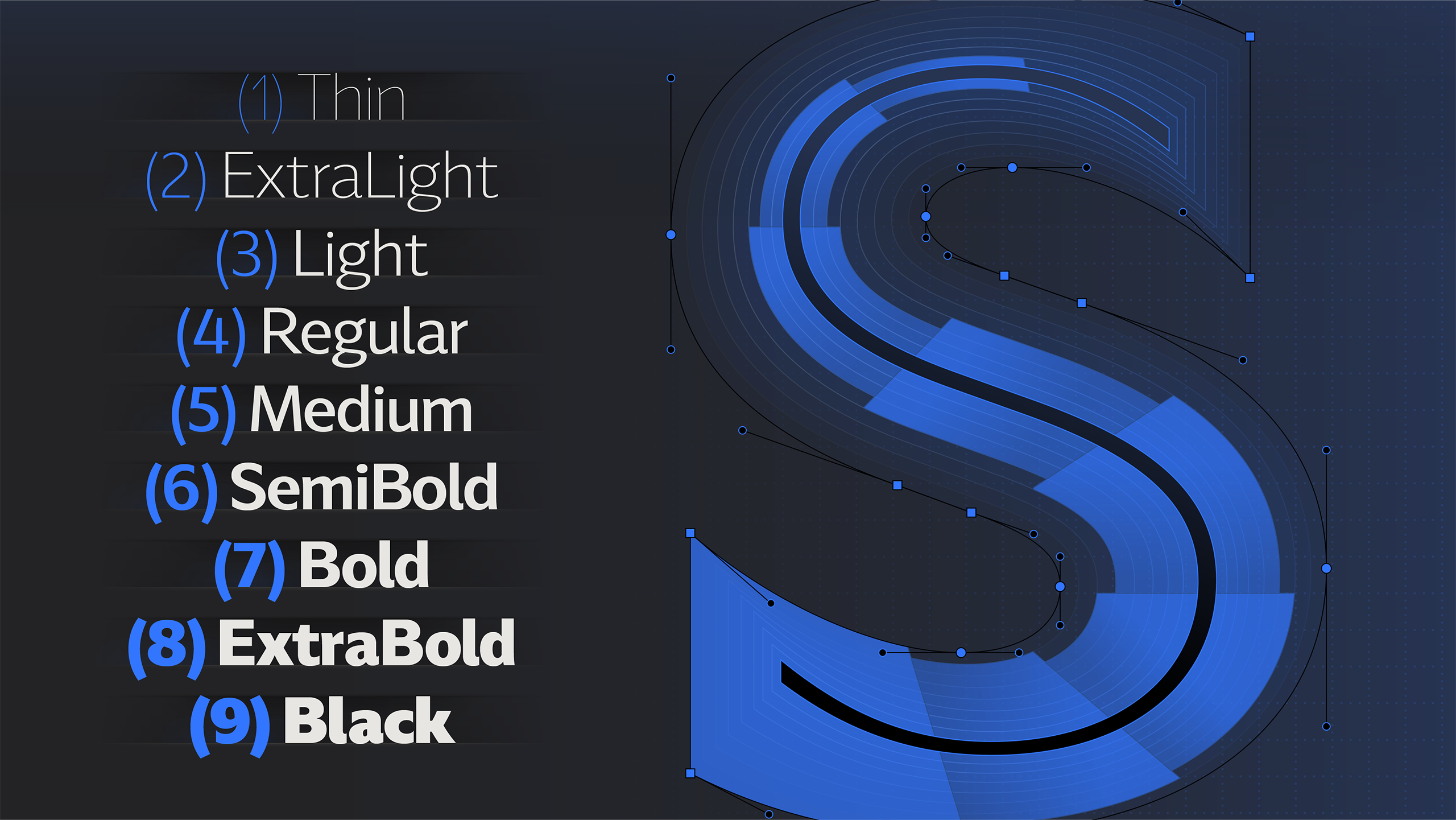
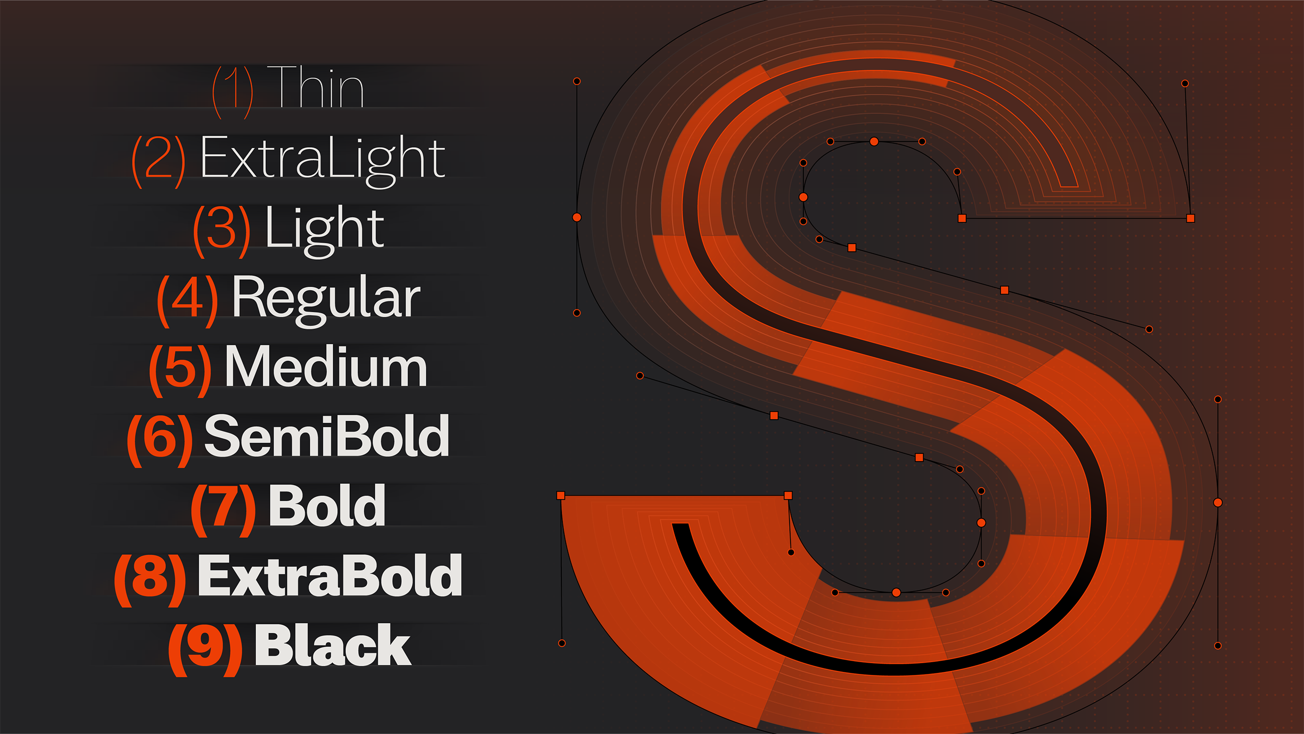
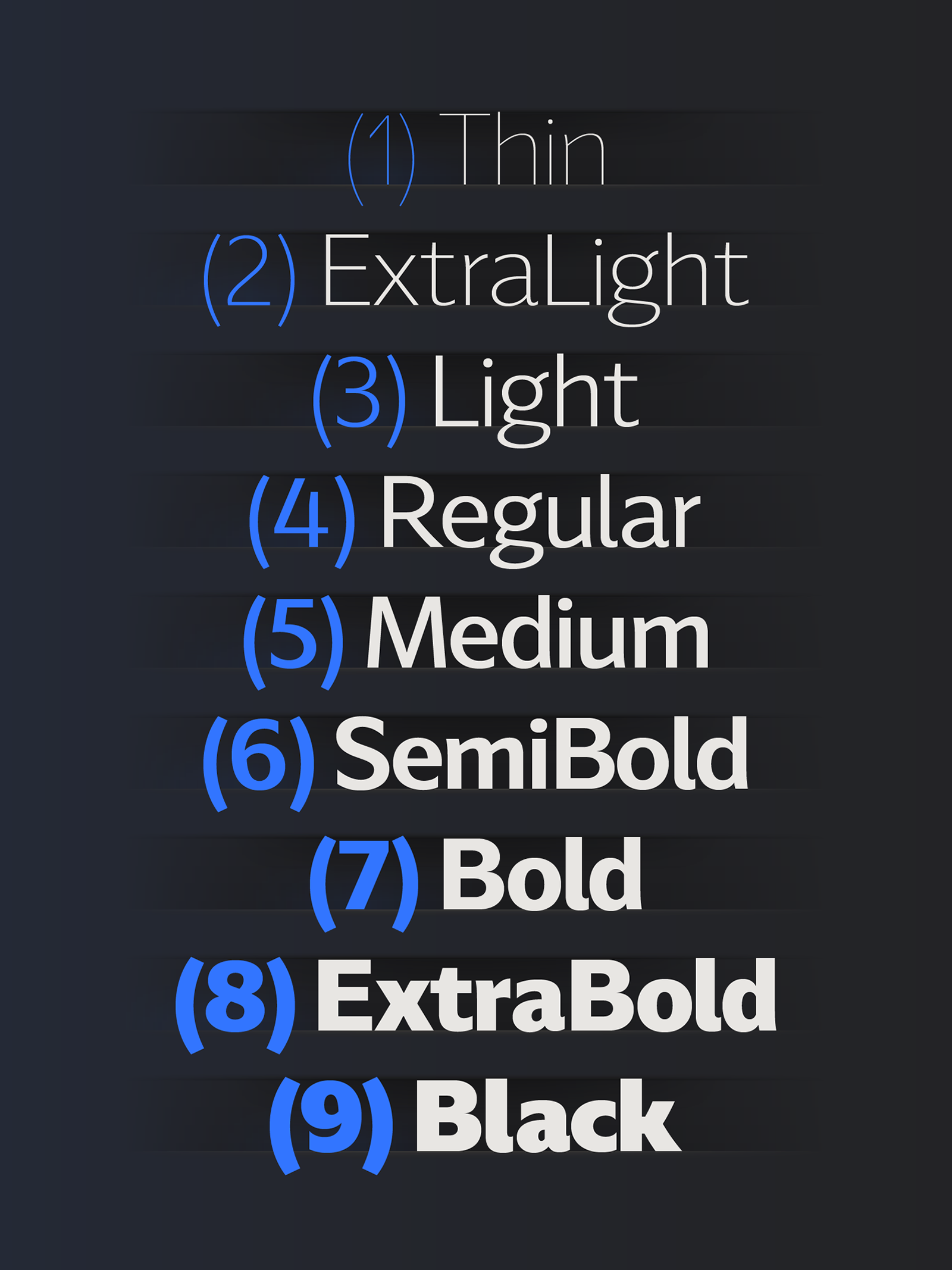
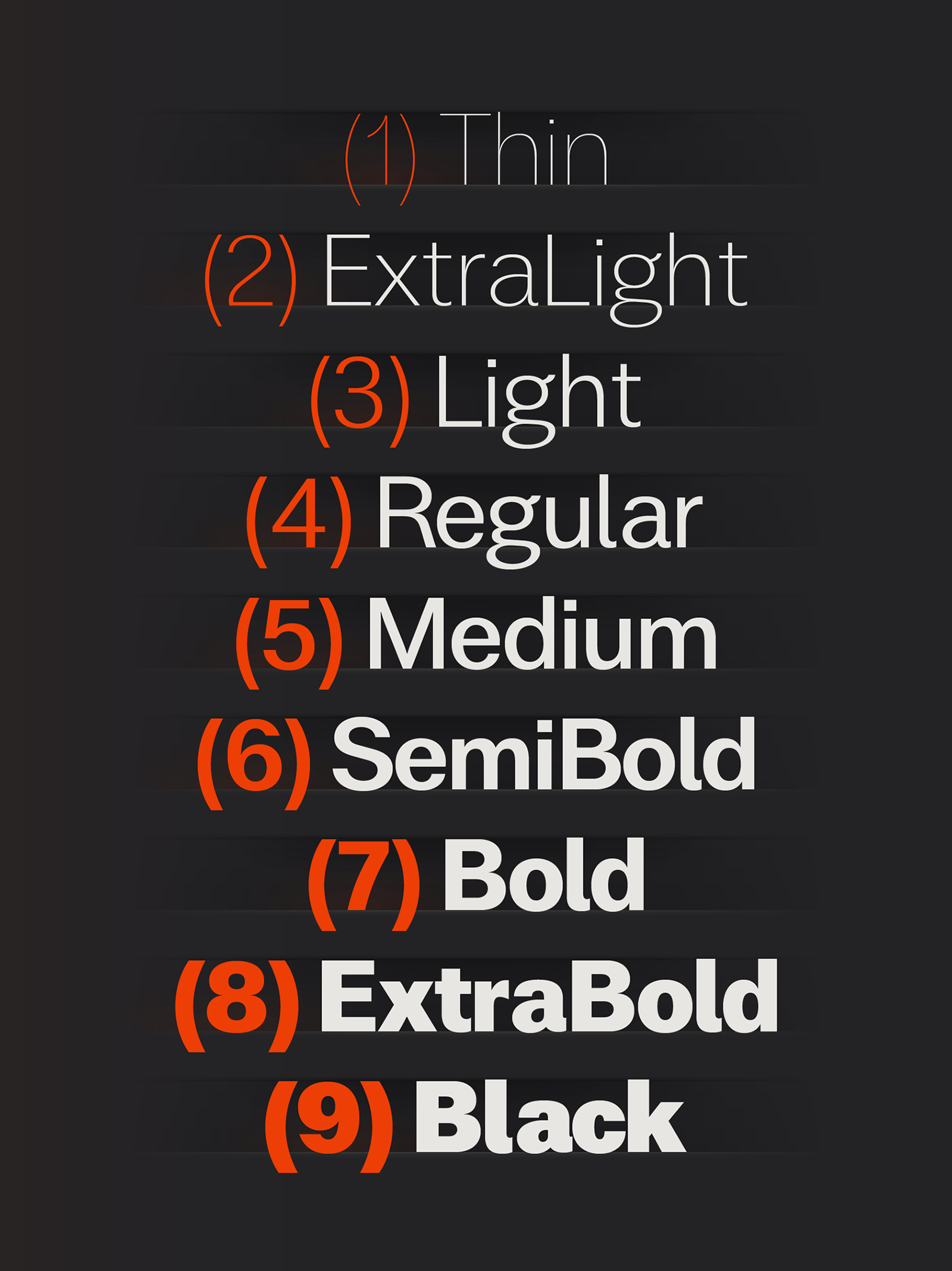
Thin
Řądíŏļõģÿ
Expressive
Neutral
Minimal
ExtraLight
Ģēőġřåphý
Expressive
Neutral
Minimal
Light
Qŭådřãtïç
Expressive
Neutral
Minimal
Regular
Mäģñifíqŭę
Expressive
Neutral
Minimal
Medium
Ğýmņăştïċ
Expressive
Neutral
Minimal
SemiBold
Ķñówļēdģę
Expressive
Neutral
Minimal
Bold
Řåtįōňâlĭżé
Expressive
Neutral
Minimal
ExtraBold
Ştřątēğìć
Expressive
Neutral
Minimal
Black
Ġřãÿśĉàļē
Expressive
Neutral
Minimal
Sans Twins Basic Characters Overview
Sans Twins Basic
Characters Overview
ABCDEFGHIJKLM
NOPQRSTUVWXYZ
NOPQRSTUVWXYZ
abcdefghijkl
mnopqrstuvwxyz
mnopqrstuvwxyz
0123456789 ?! & “{[ (: ;) ]}”
ABCDEFGHI
JKLMNOPQ
RSTUVWXYZ
JKLMNOPQ
RSTUVWXYZ
abcdefgh
ijklmnopq
rstuvwxyz
ijklmnopq
rstuvwxyz
0123456789
?! & “{[ (: ;) ]}”
?! & “{[ (: ;) ]}”
Sans Twins in Text
Sans Twins in Text
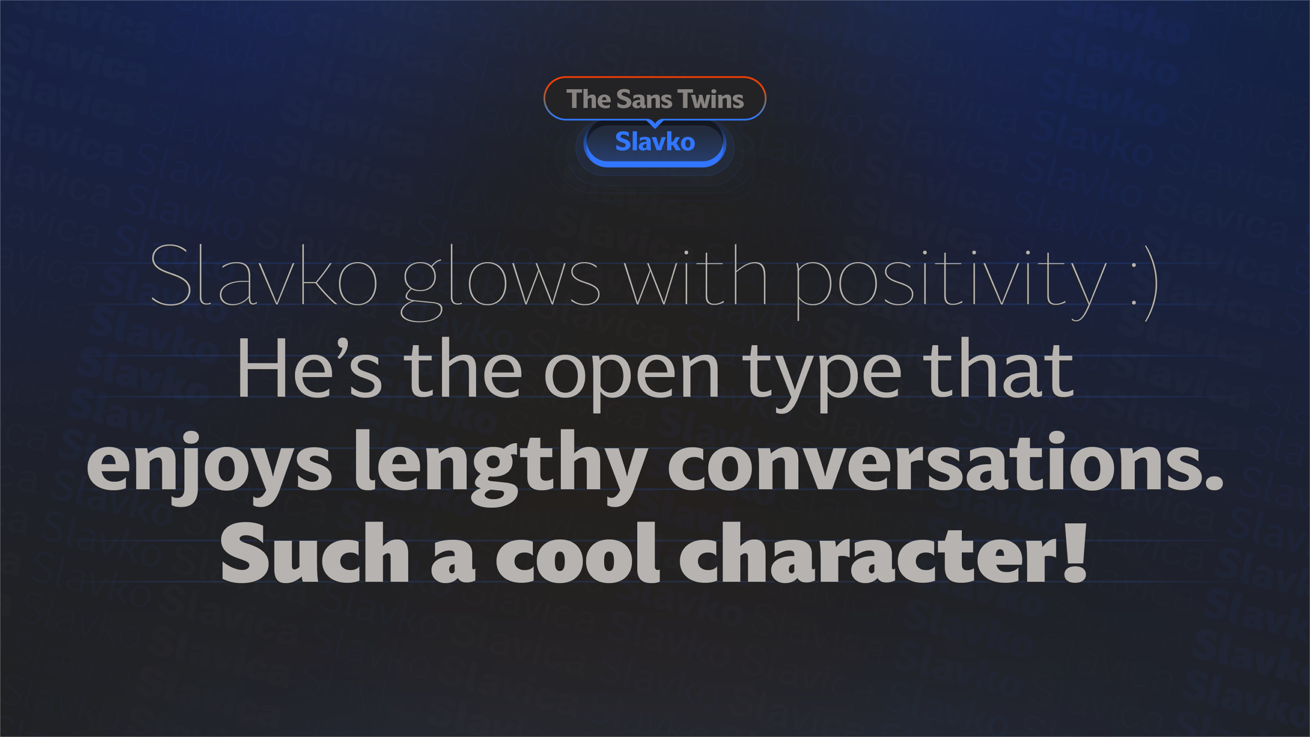
The Humanist style within the realm of sans-serif typography is characterized by a harmonious blend of legibility and subtle design nuances inspired by classical letterforms. Rooted in the principles of human handwriting, this style often features open apertures, warm curves, and a balanced stroke contrast. The Humanist sans-serif seeks to bridge the gap between traditional serifs and modern sans-serifs, infusing a touch of humanity and organic flow into the letter shapes. This timeless, versatile style prioritizes readability and user-friendly design, making it well-suited for various design contexts, from print to digital media. The Humanist sans-serif stands as a testament to the thoughtful marriage of form and function in typographic expression.
The Neogrotesk style of sans-serif typography emphasizes simplicity, geometric precision, and clean design. Originating in the early 20th century, Neogrotesk, also known as grotesque or Swiss style, prioritizes clear, legible letterforms and minimalistic shapes over ornate details. With uniform stroke widths and sans-serif simplicity, Neogrotesk fonts offer neutrality and versatility, making them a popular choice across various design applications. This timeless style embodies clarity and efficiency in visual communication, reflecting a steadfast commitment to functional design principles and everlasting aesthetic appeal, ensuring its continued relevance and enduring popularity in contemporary graphic design practices and applications worldwide.