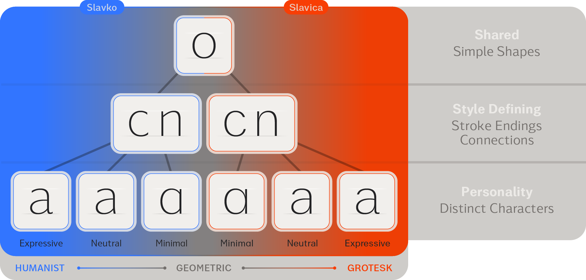
 The Sans Twins System Chart
The Sans Twins System Chart
The Sans Twins System Chart
The Sans Twins
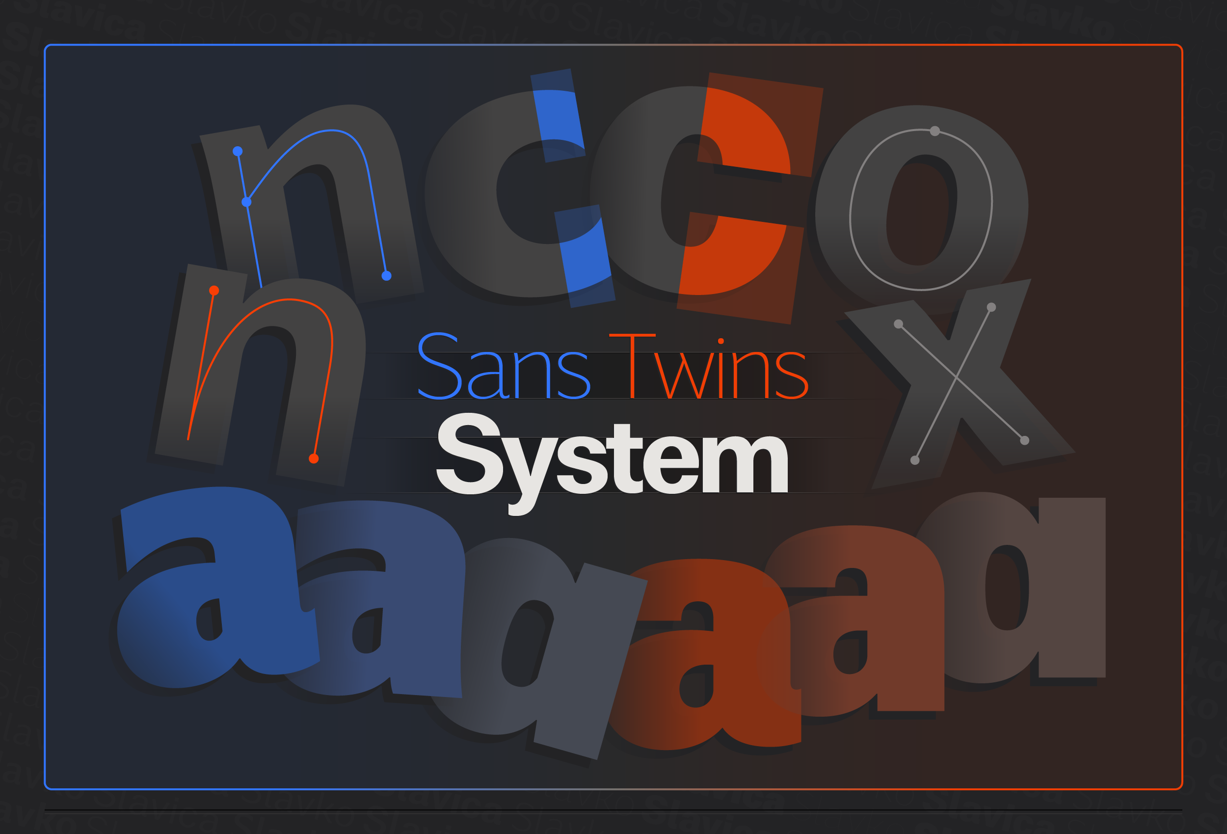
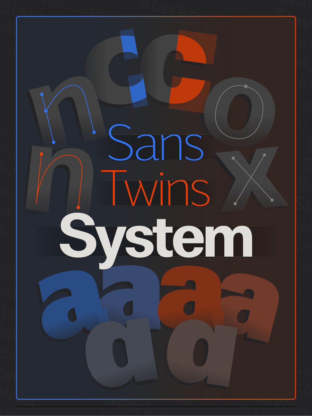
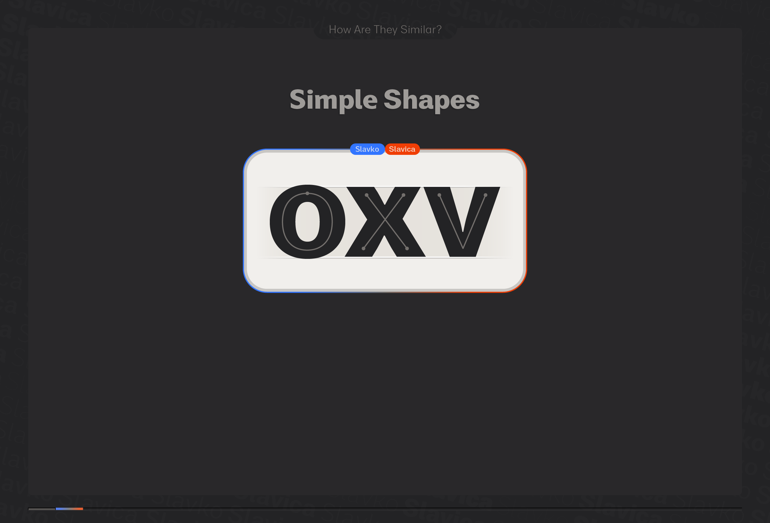
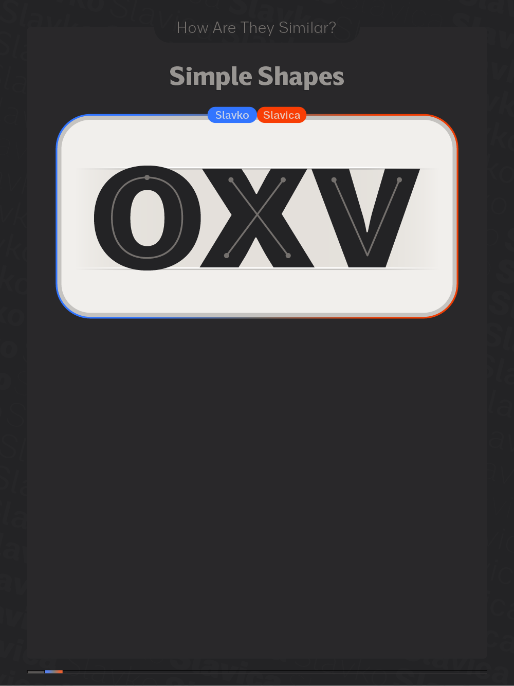
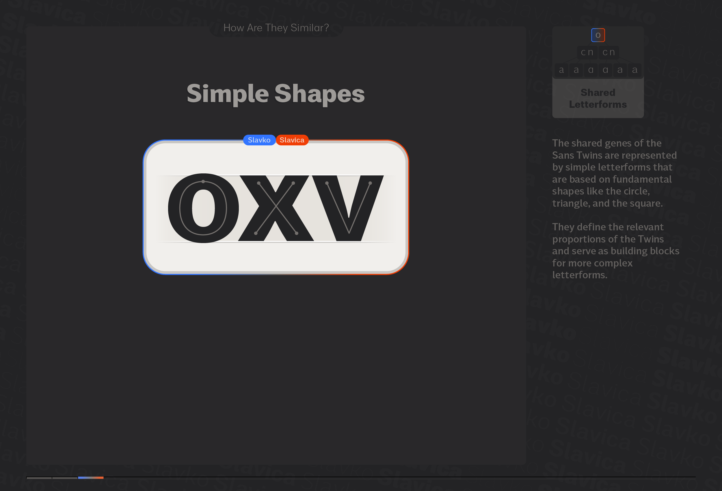
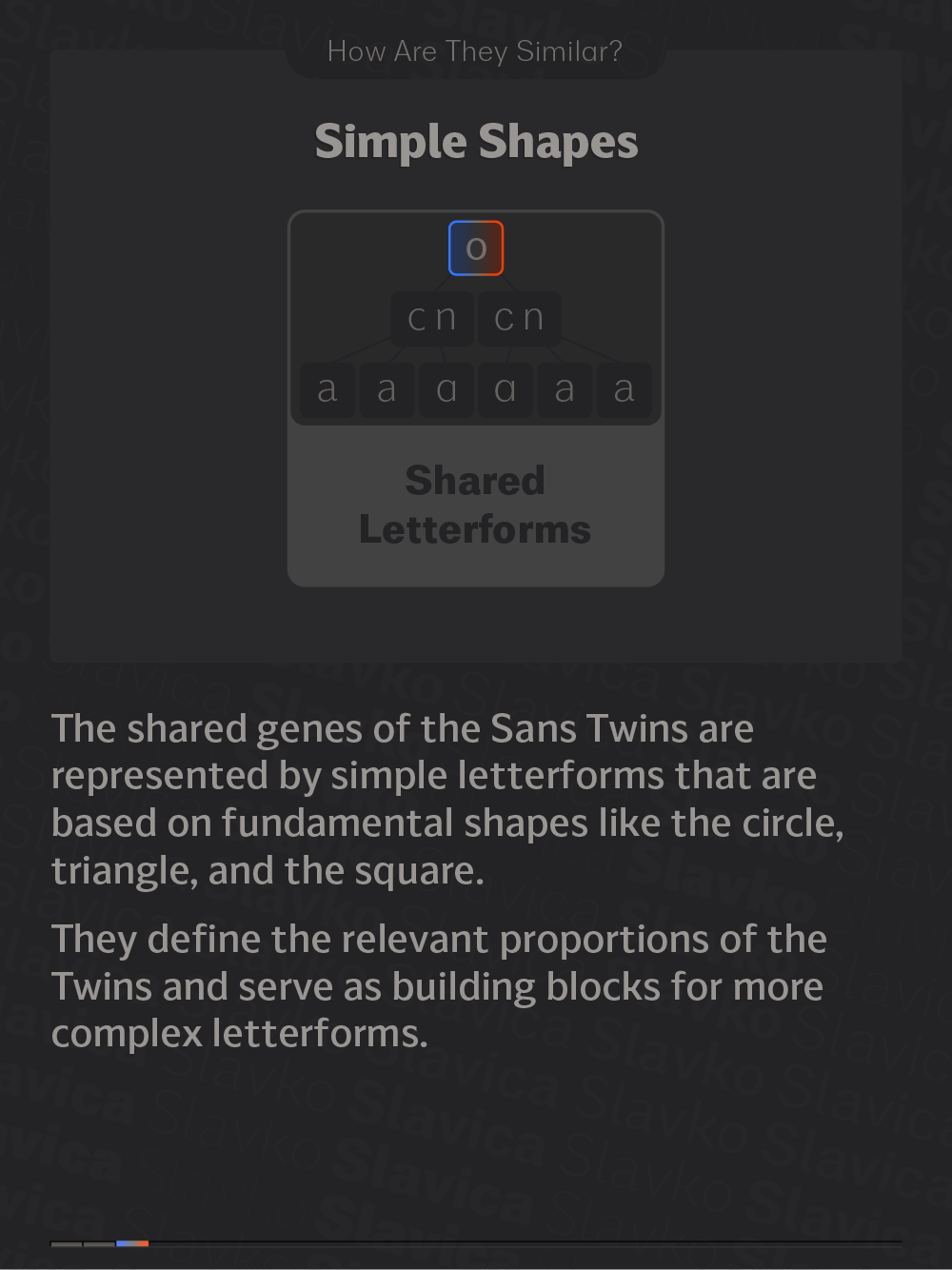
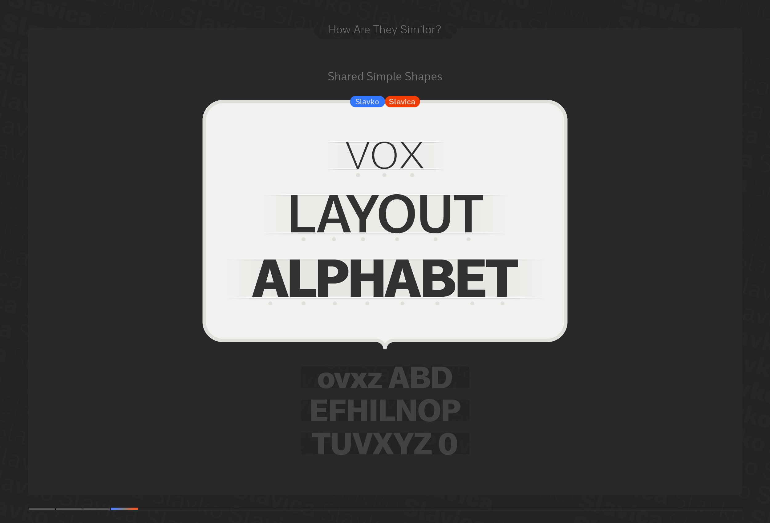
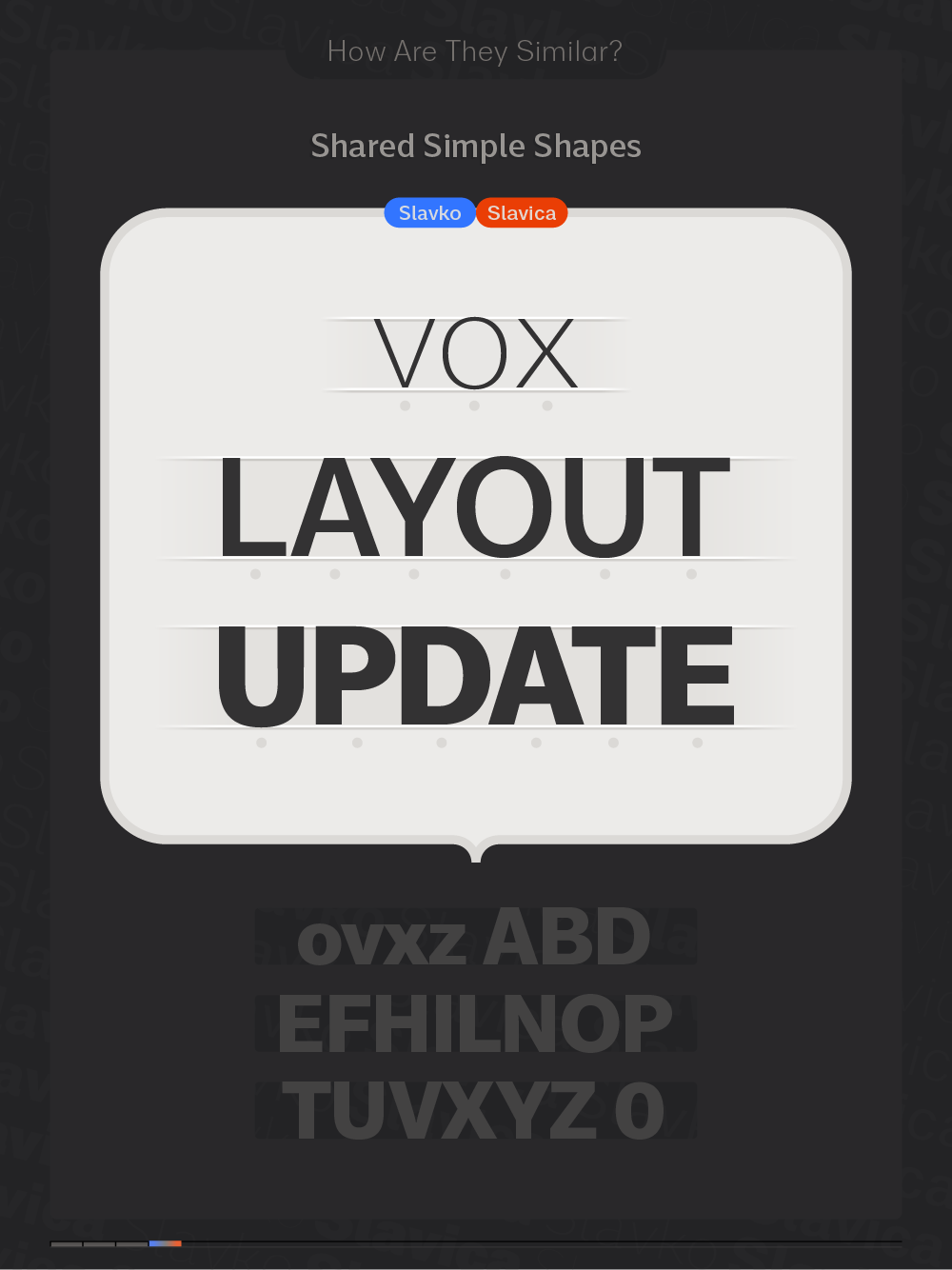
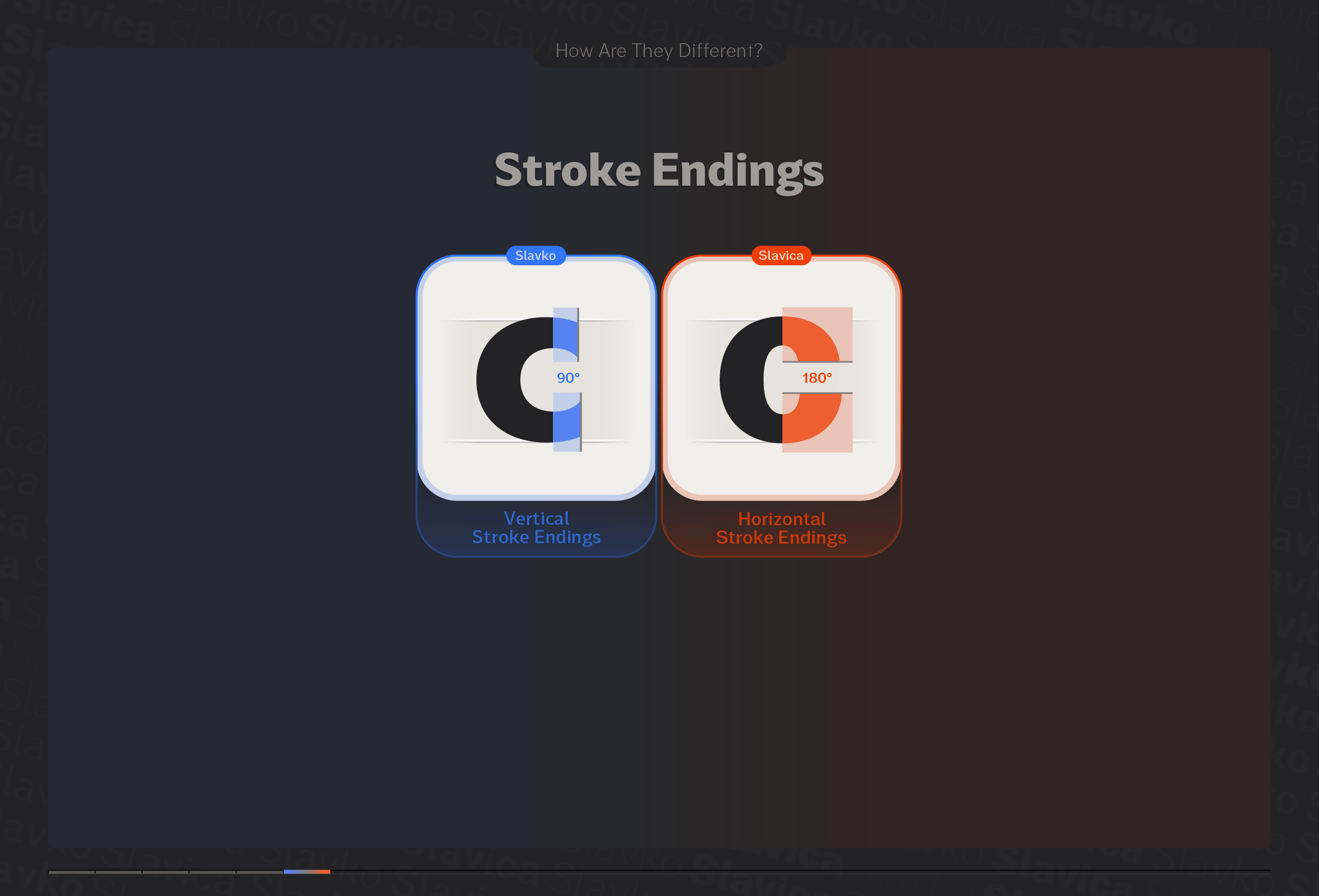
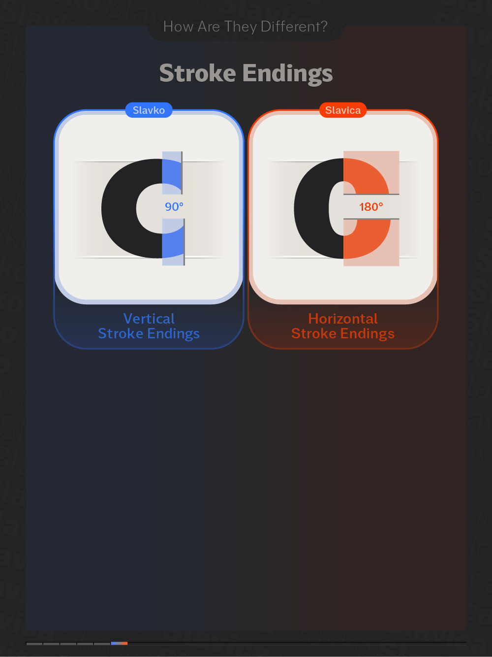
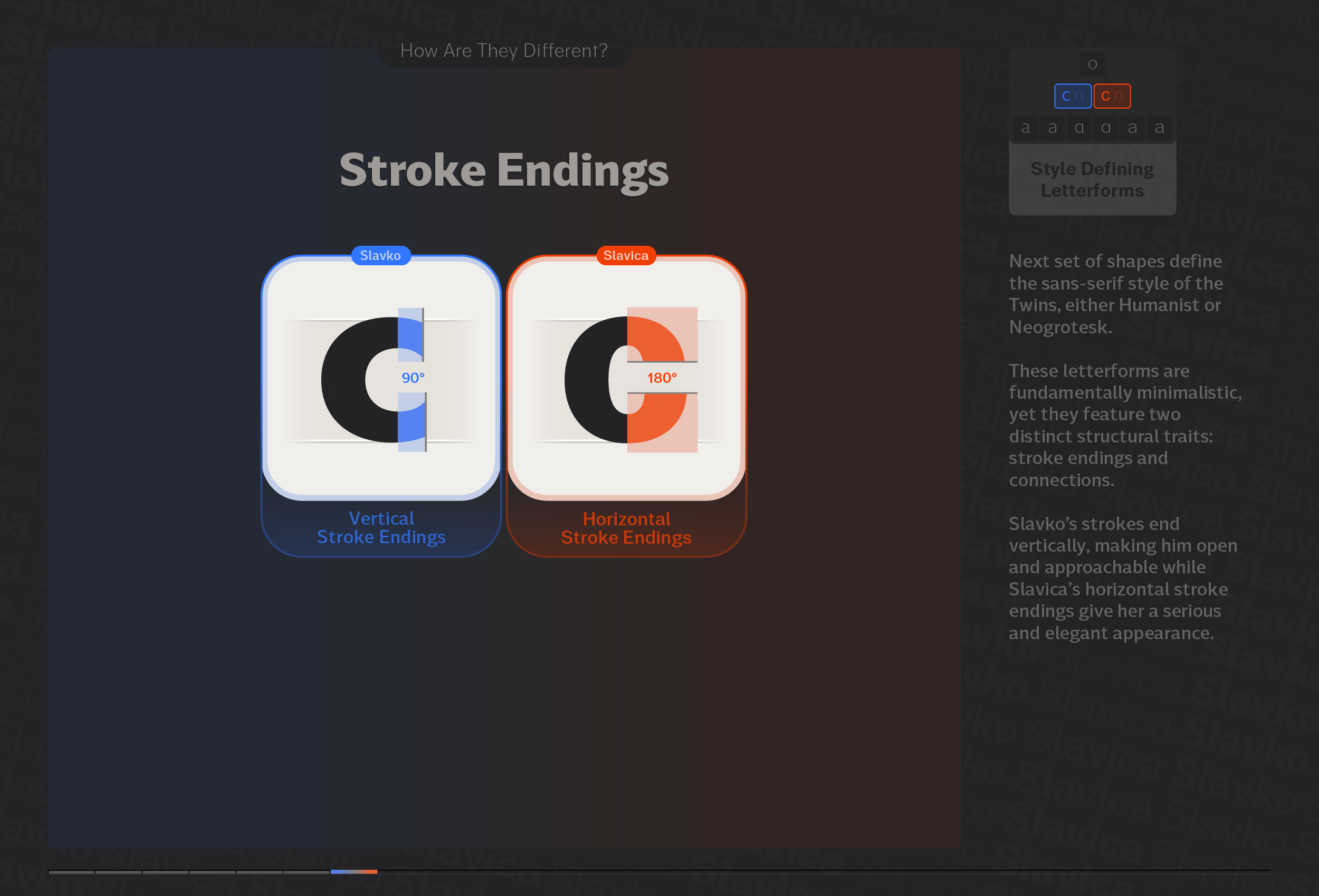
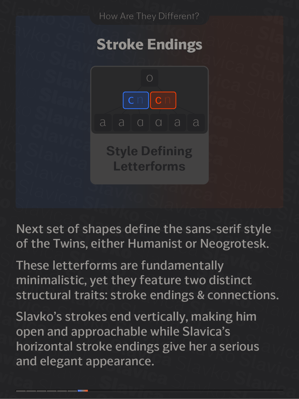
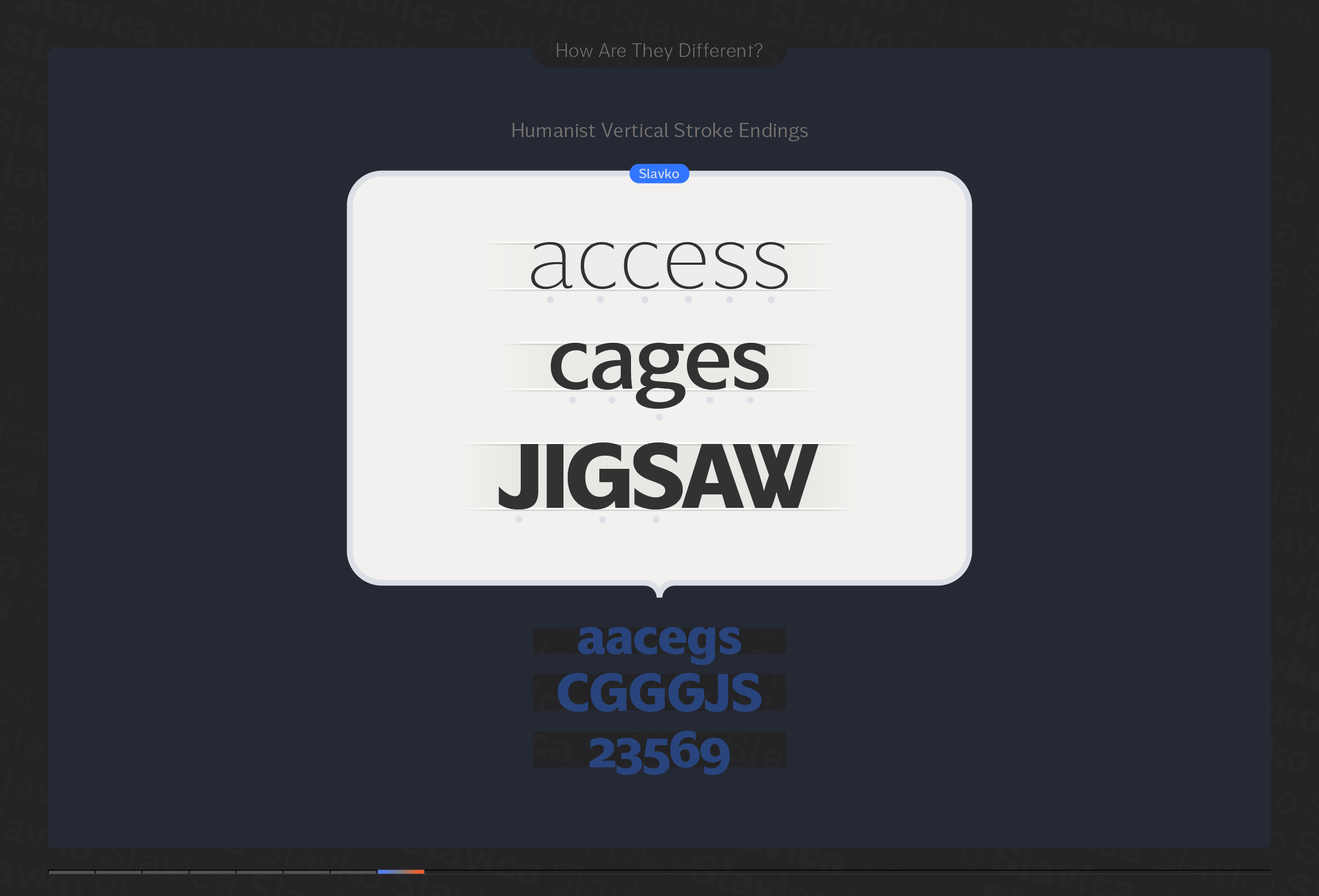
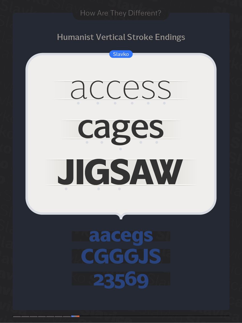
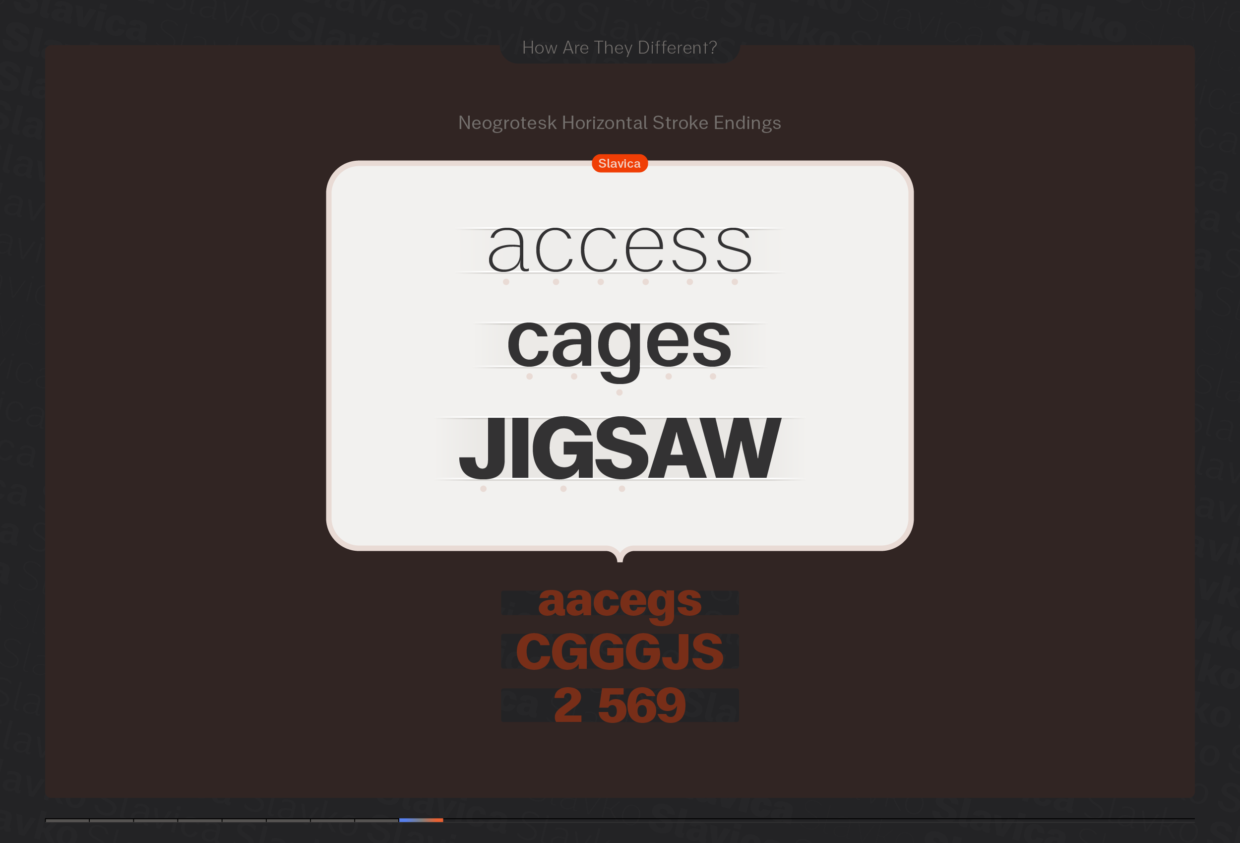
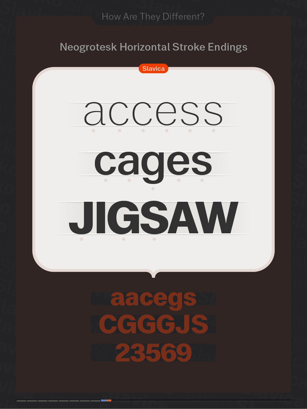
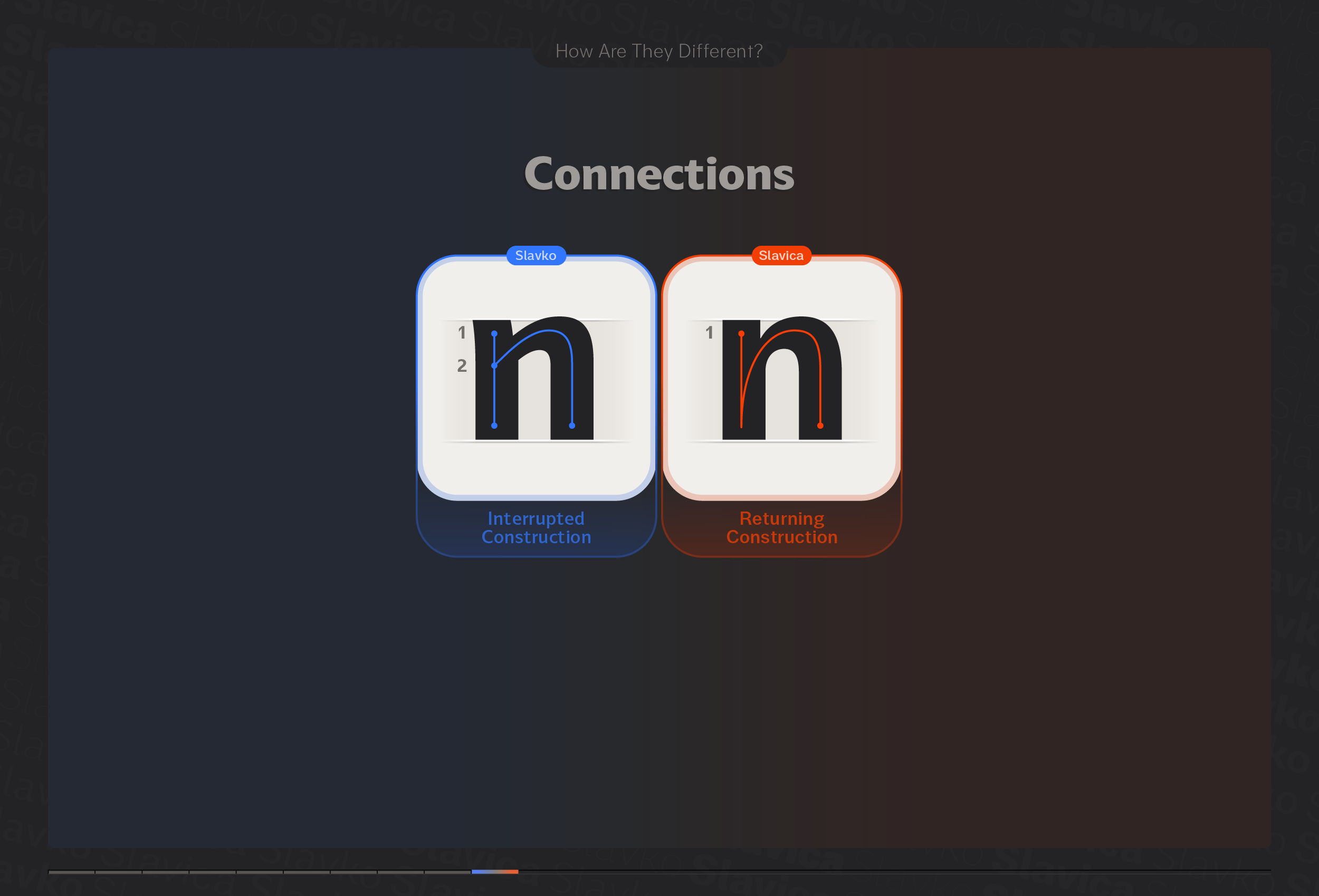
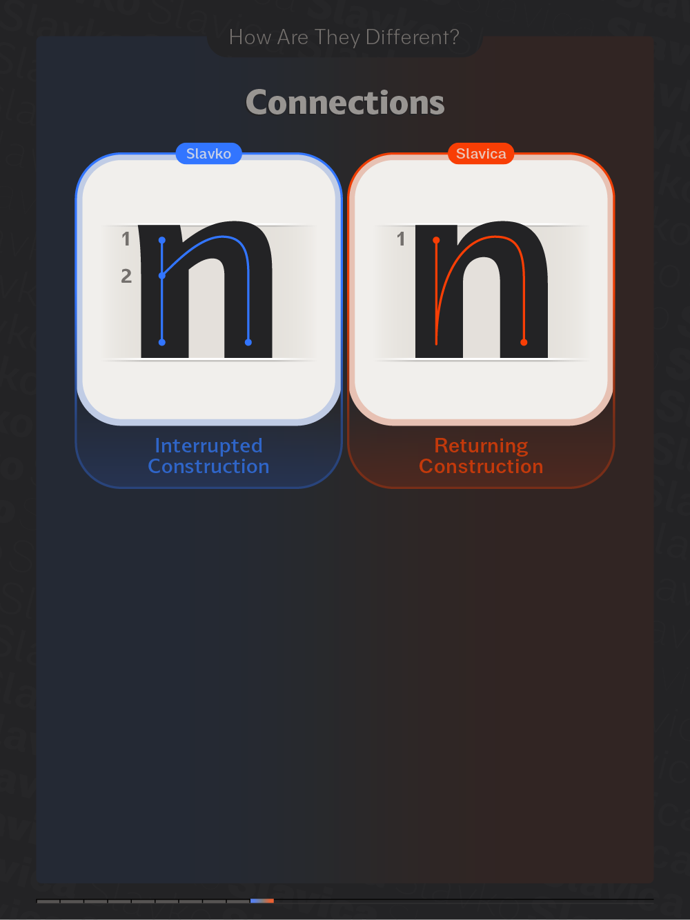
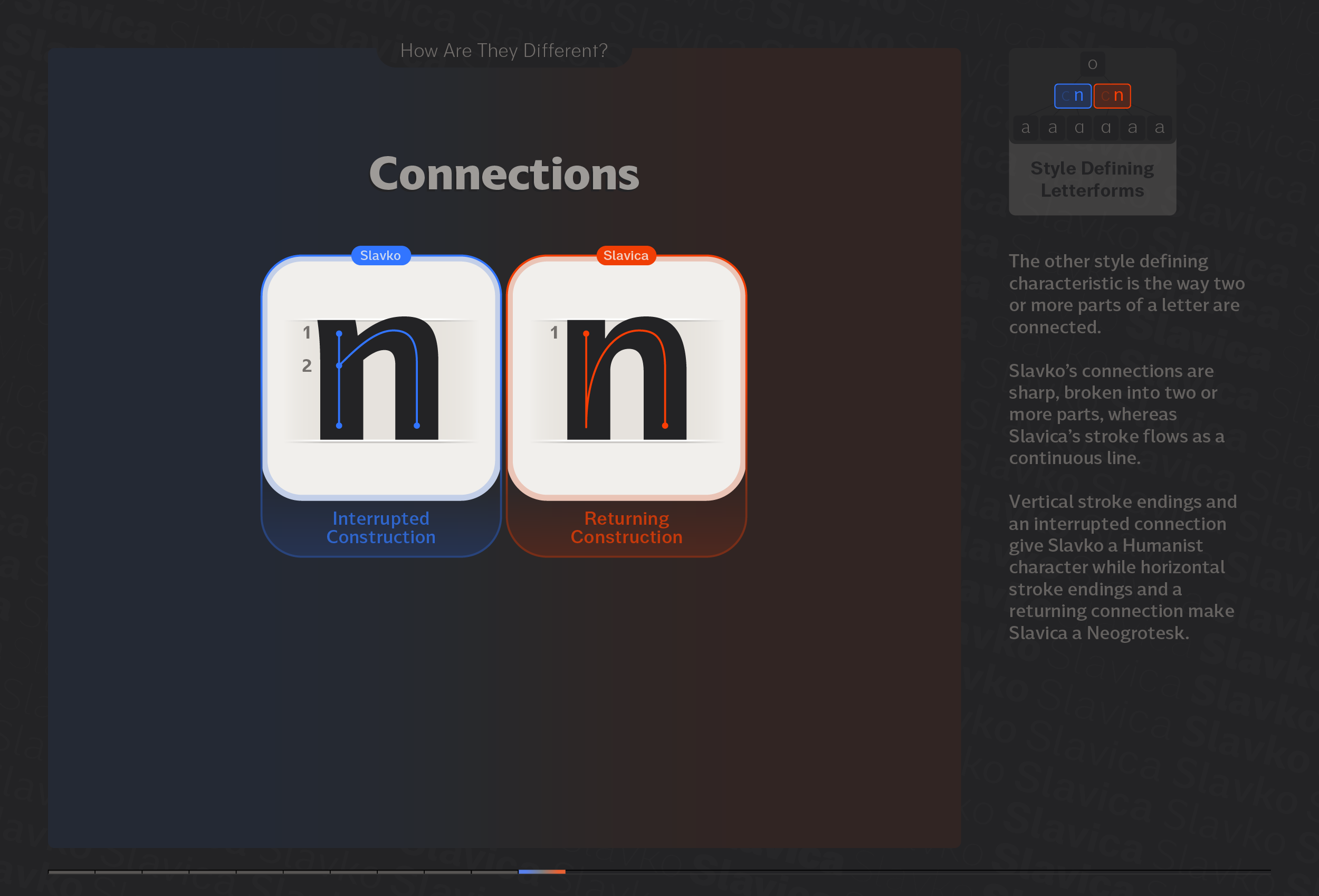
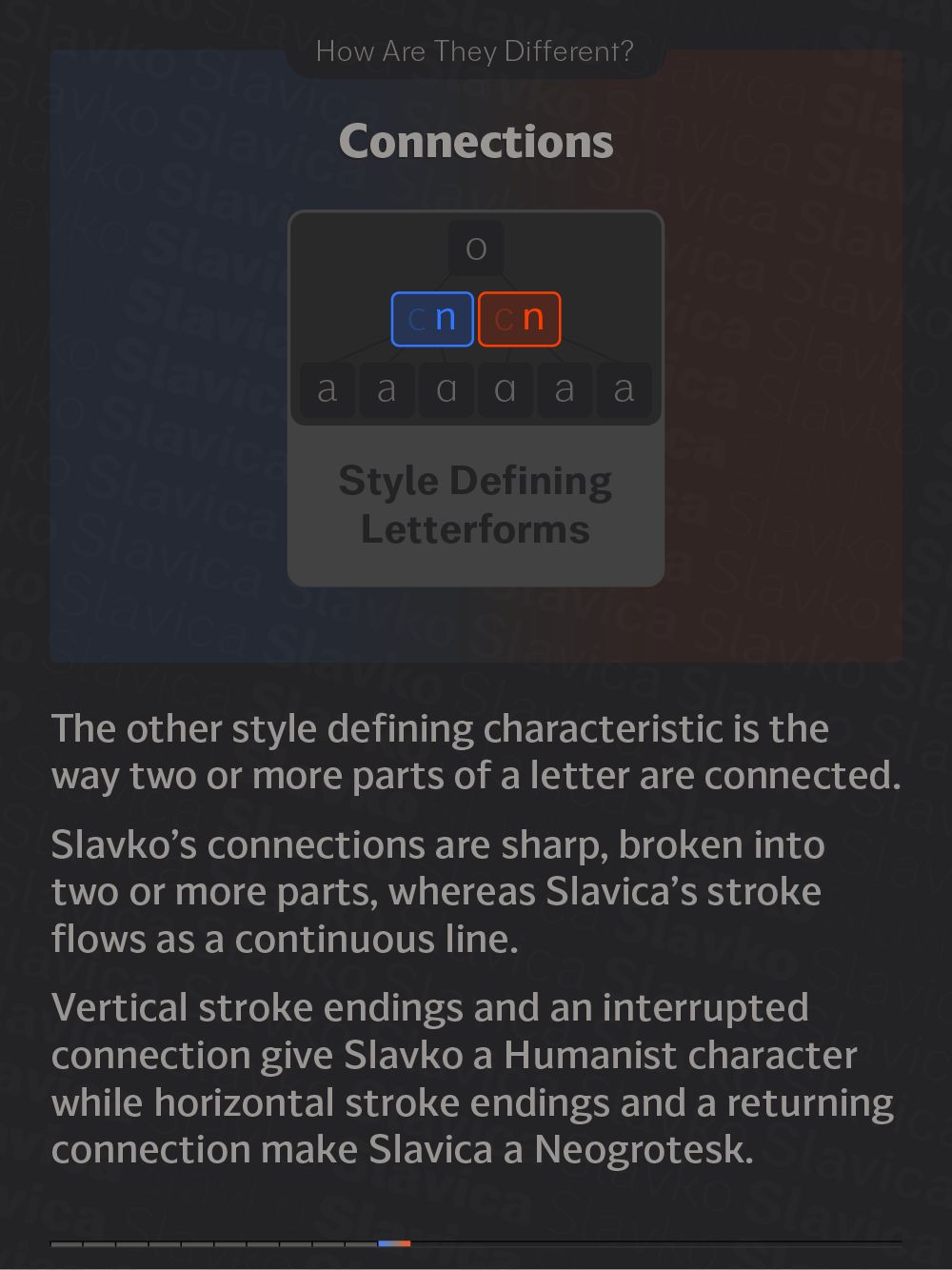
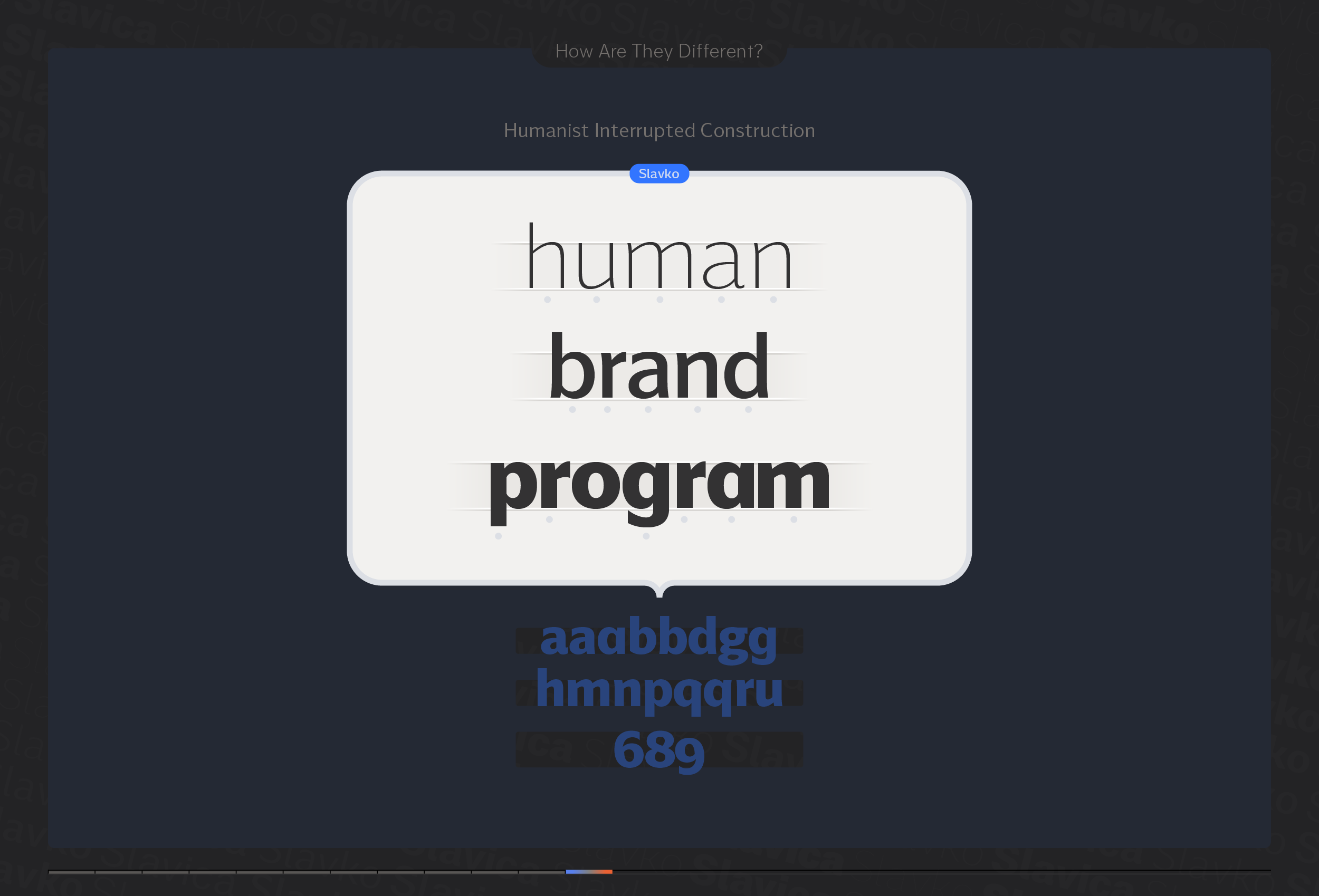
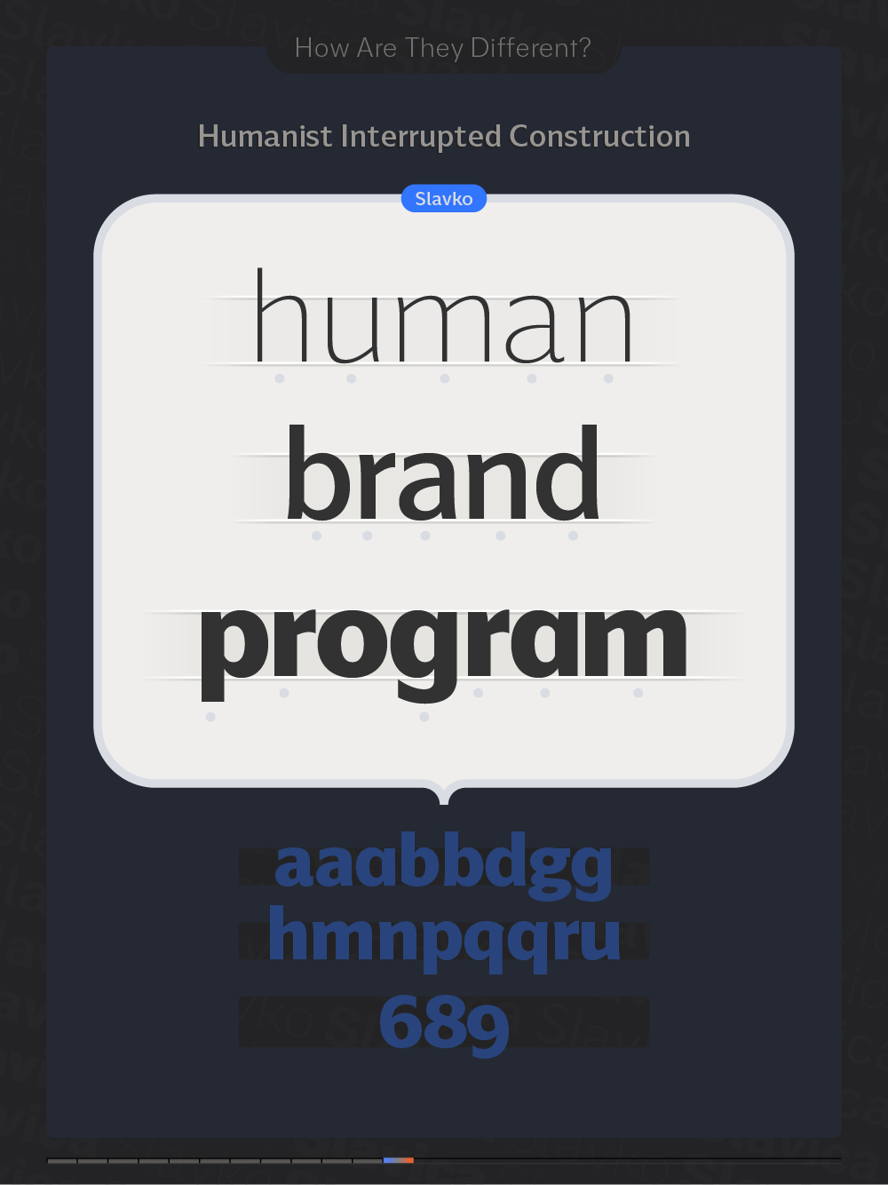
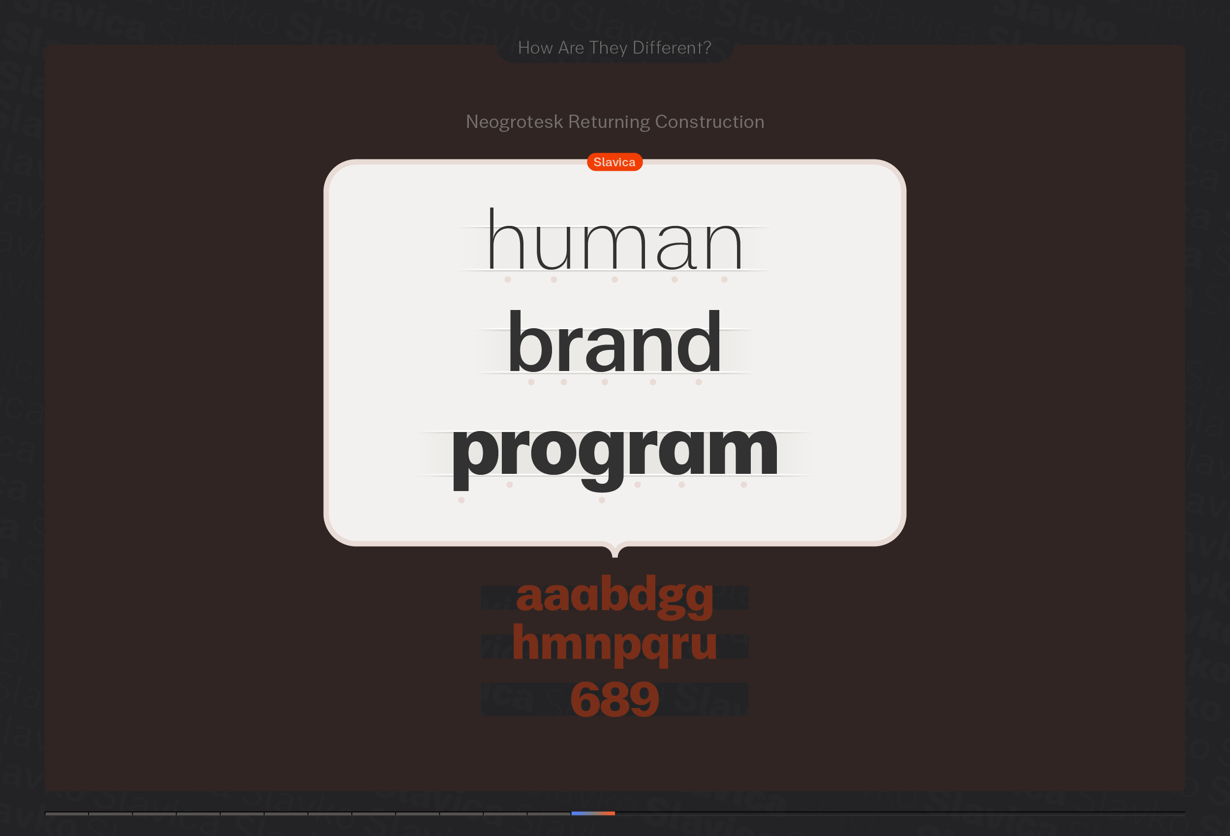
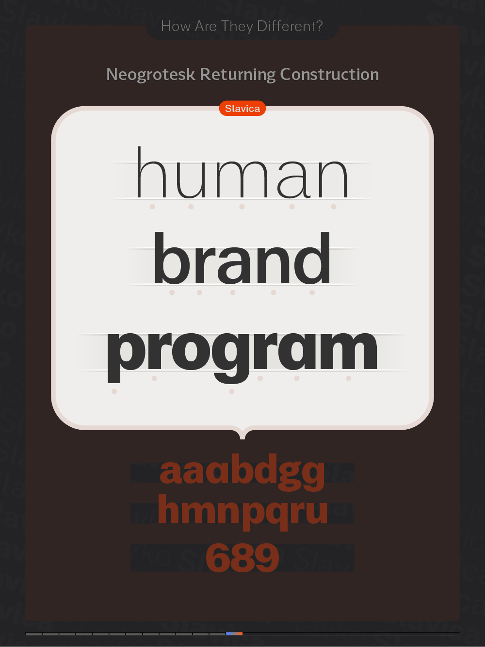
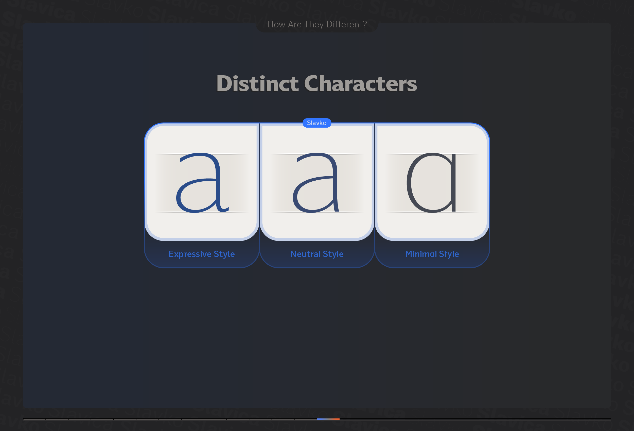
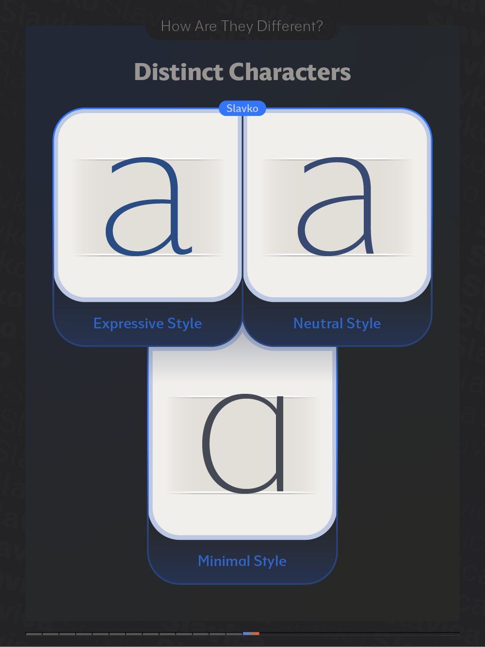
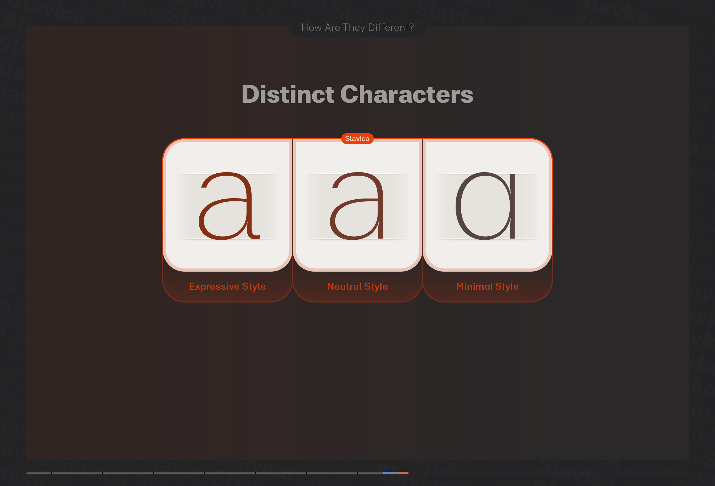
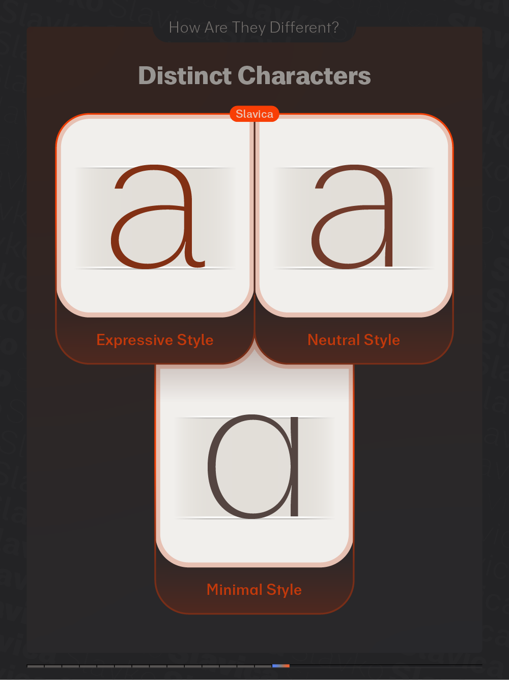
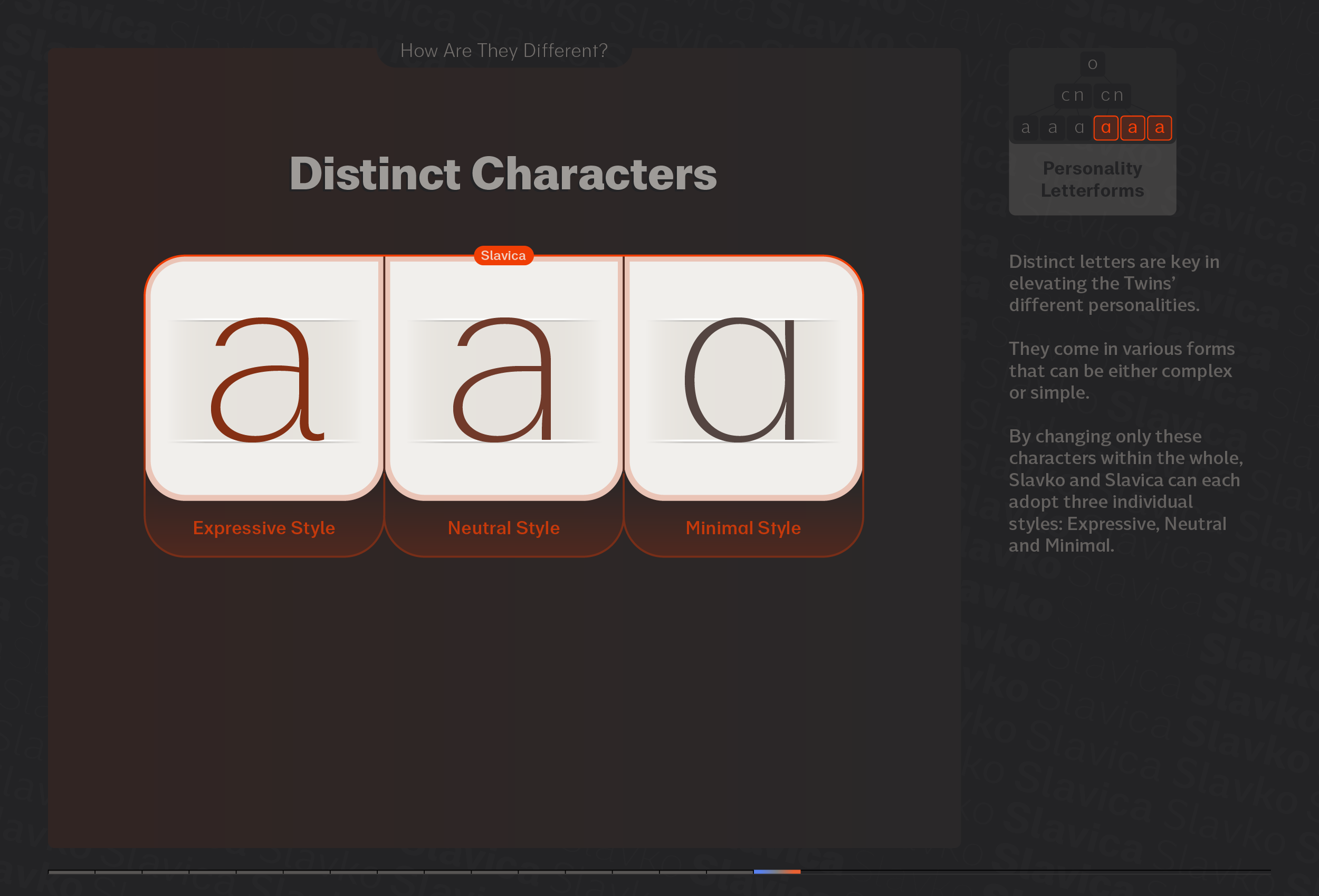
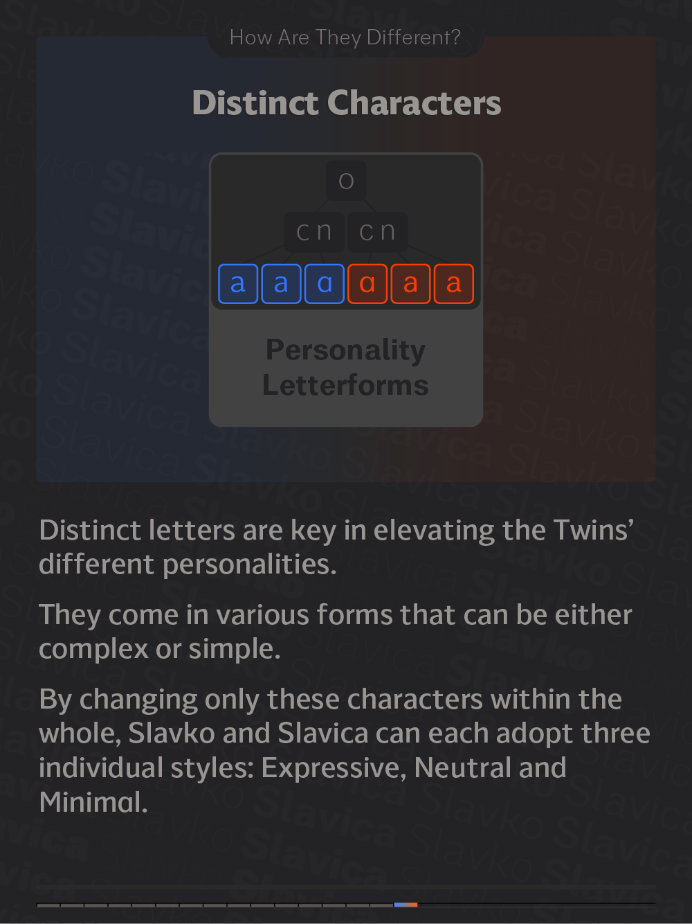
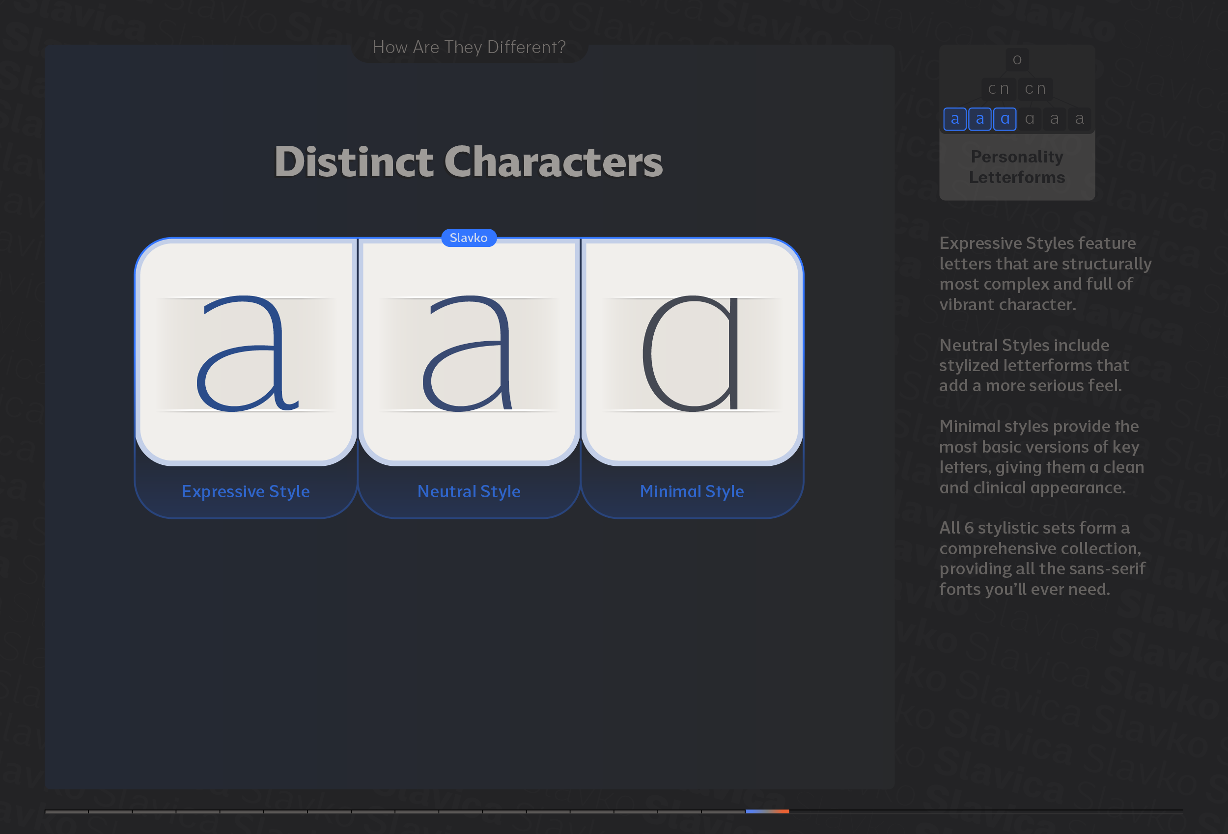
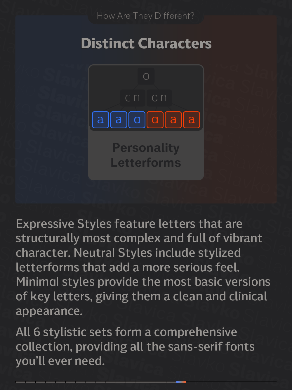
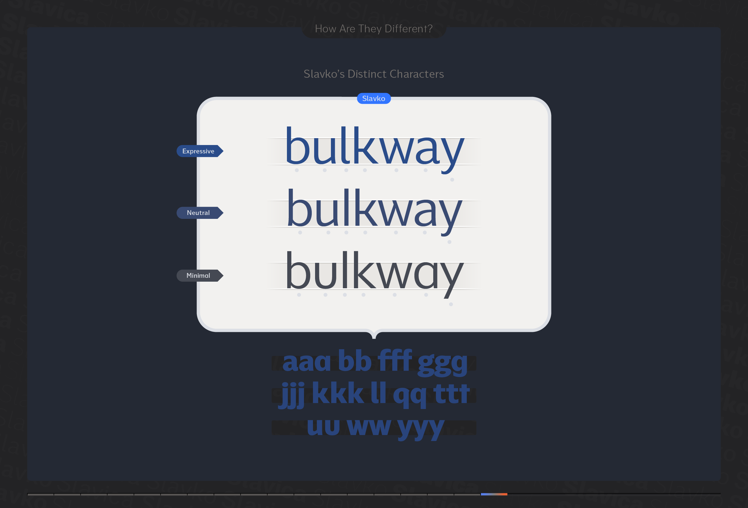
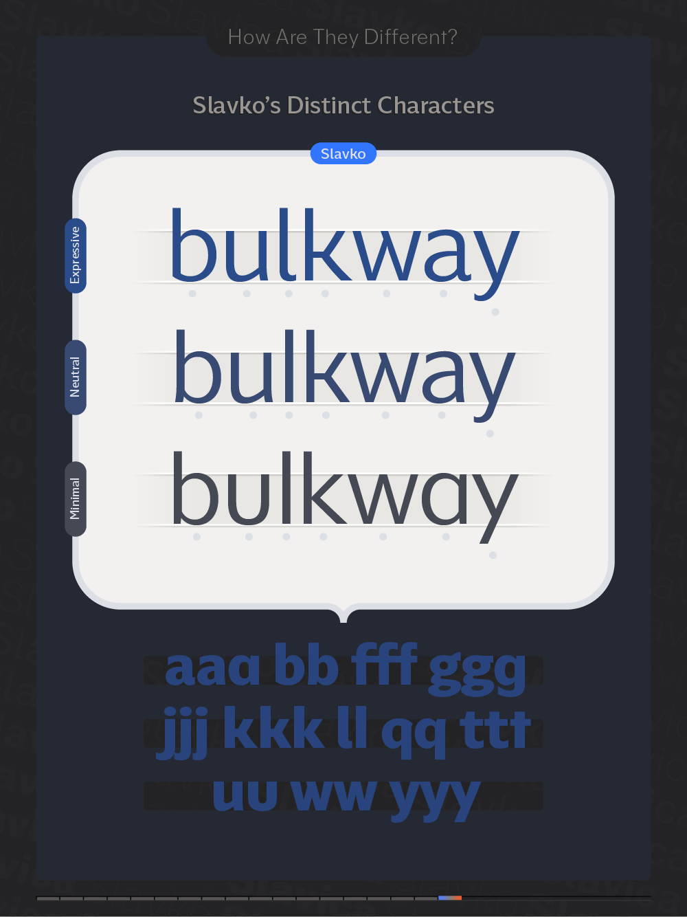
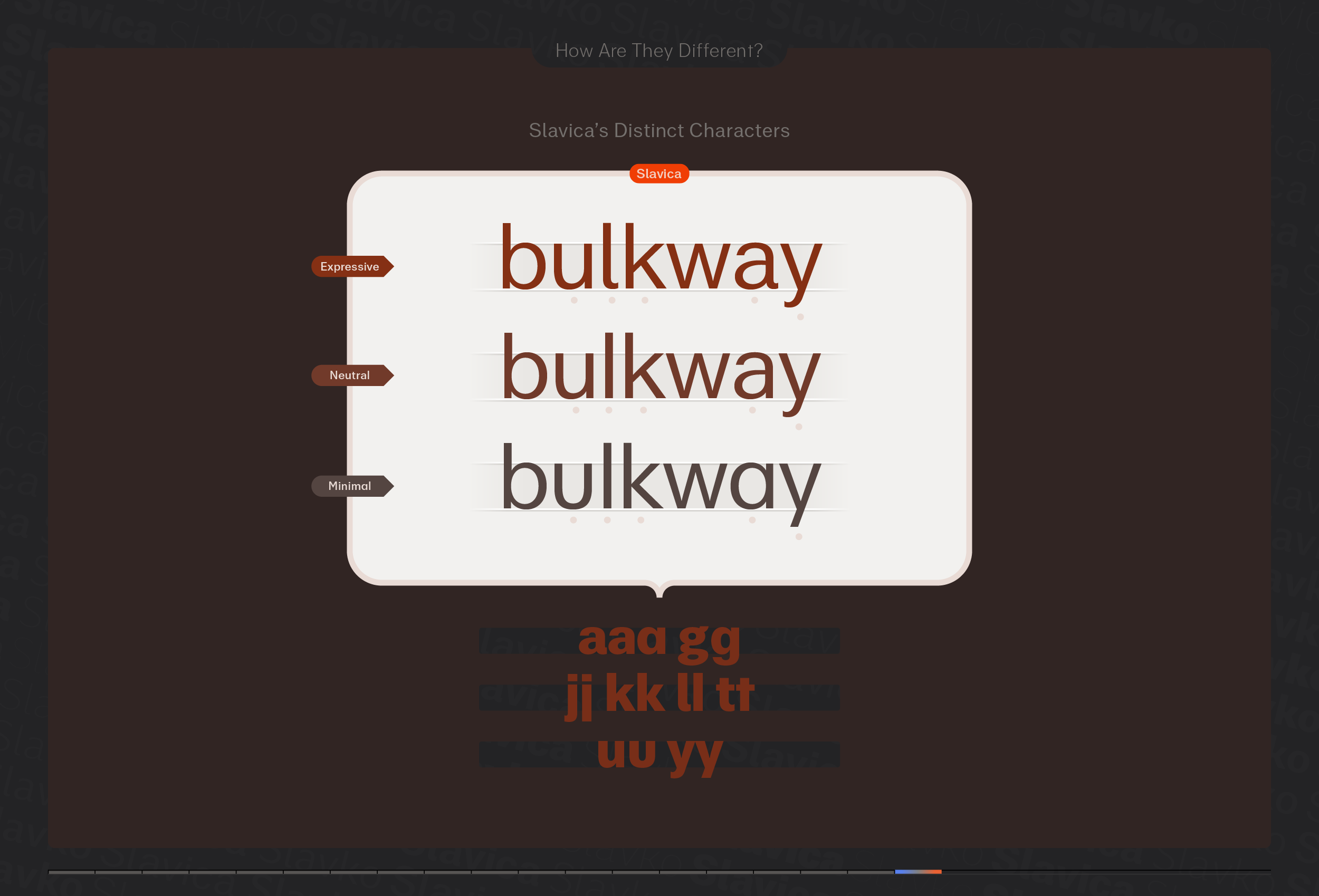
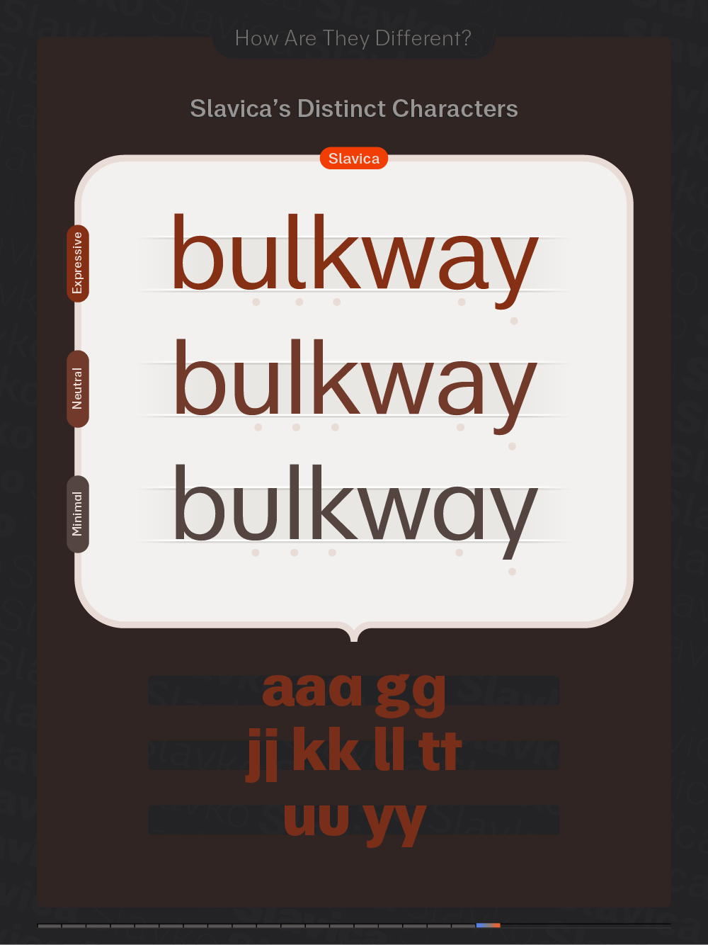
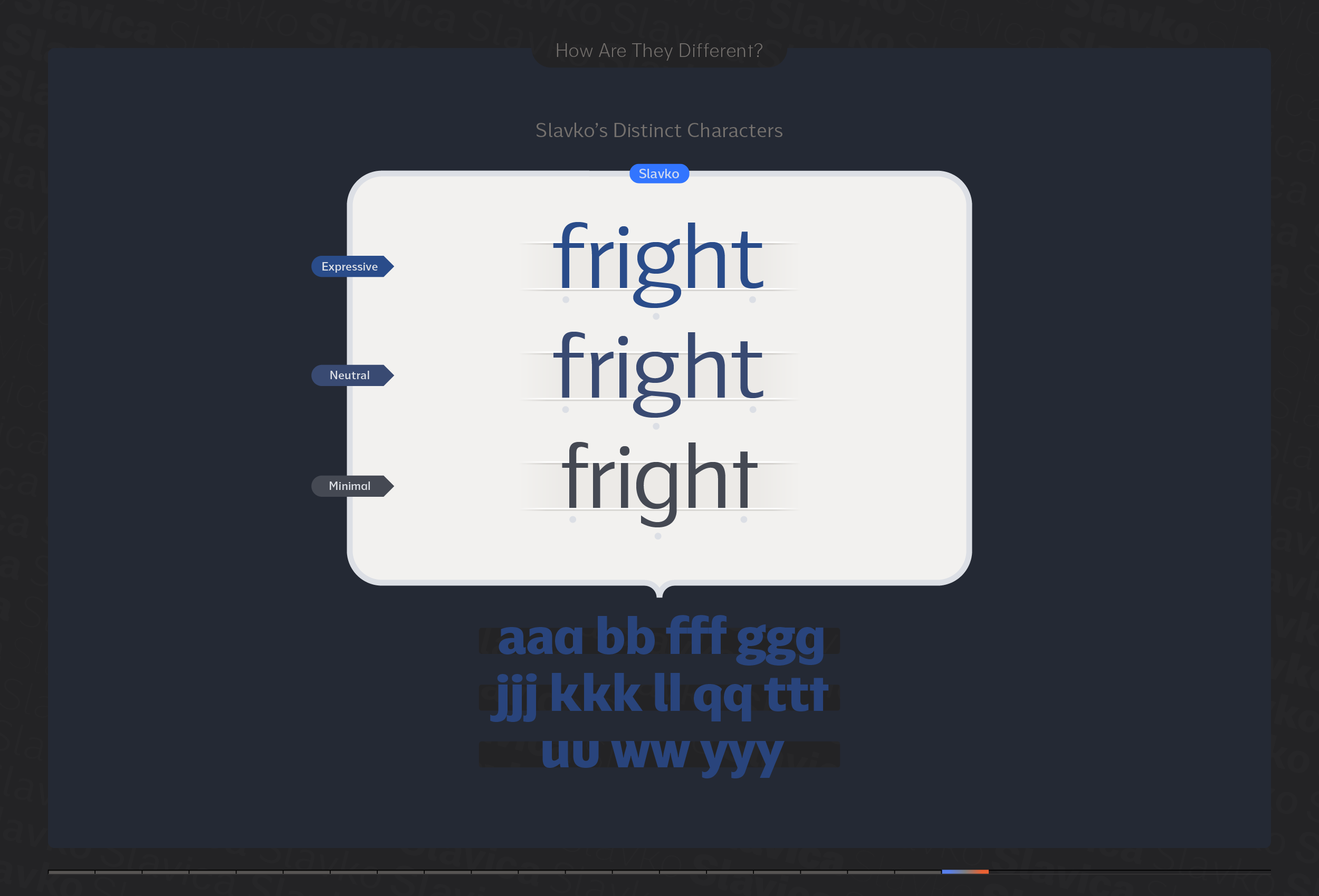
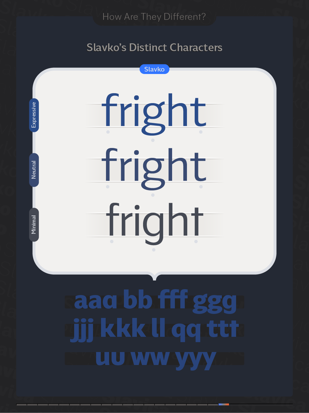
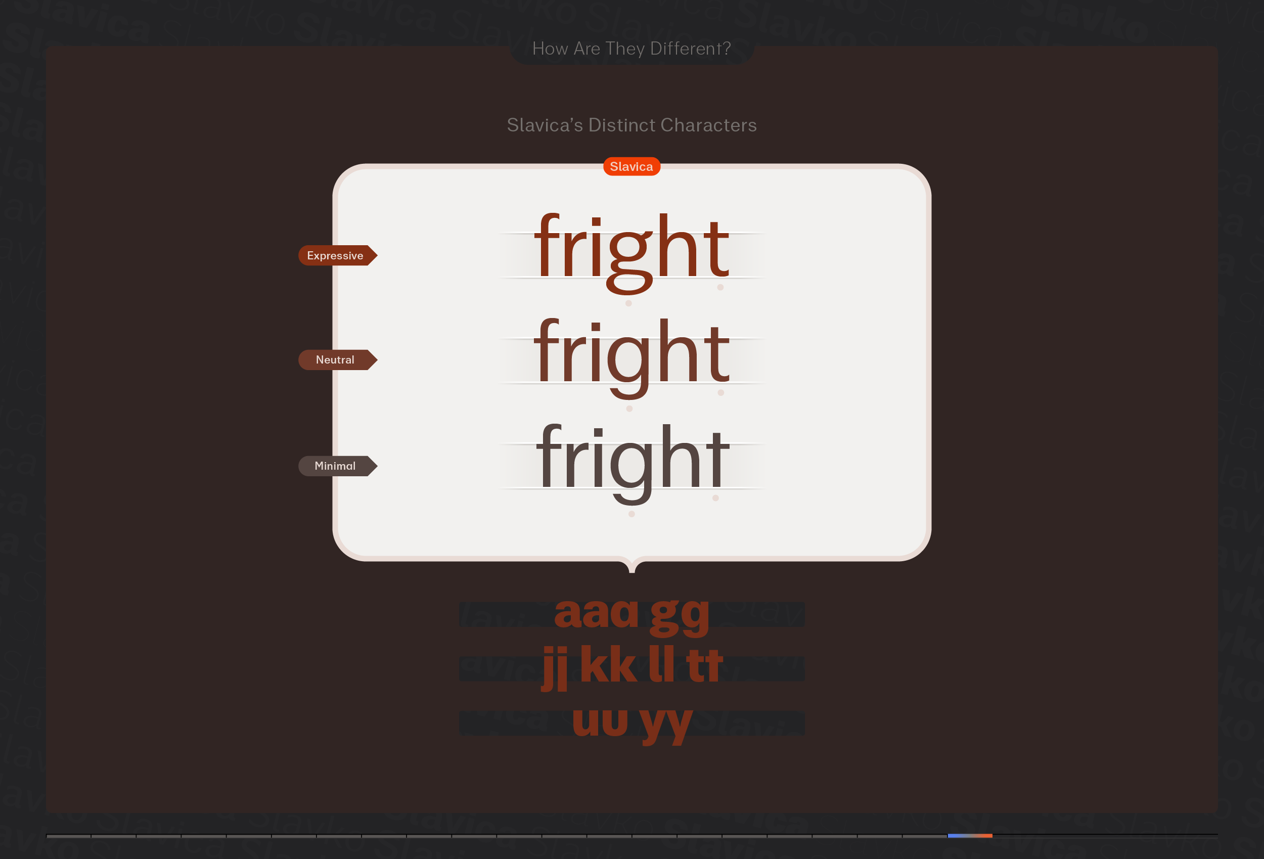
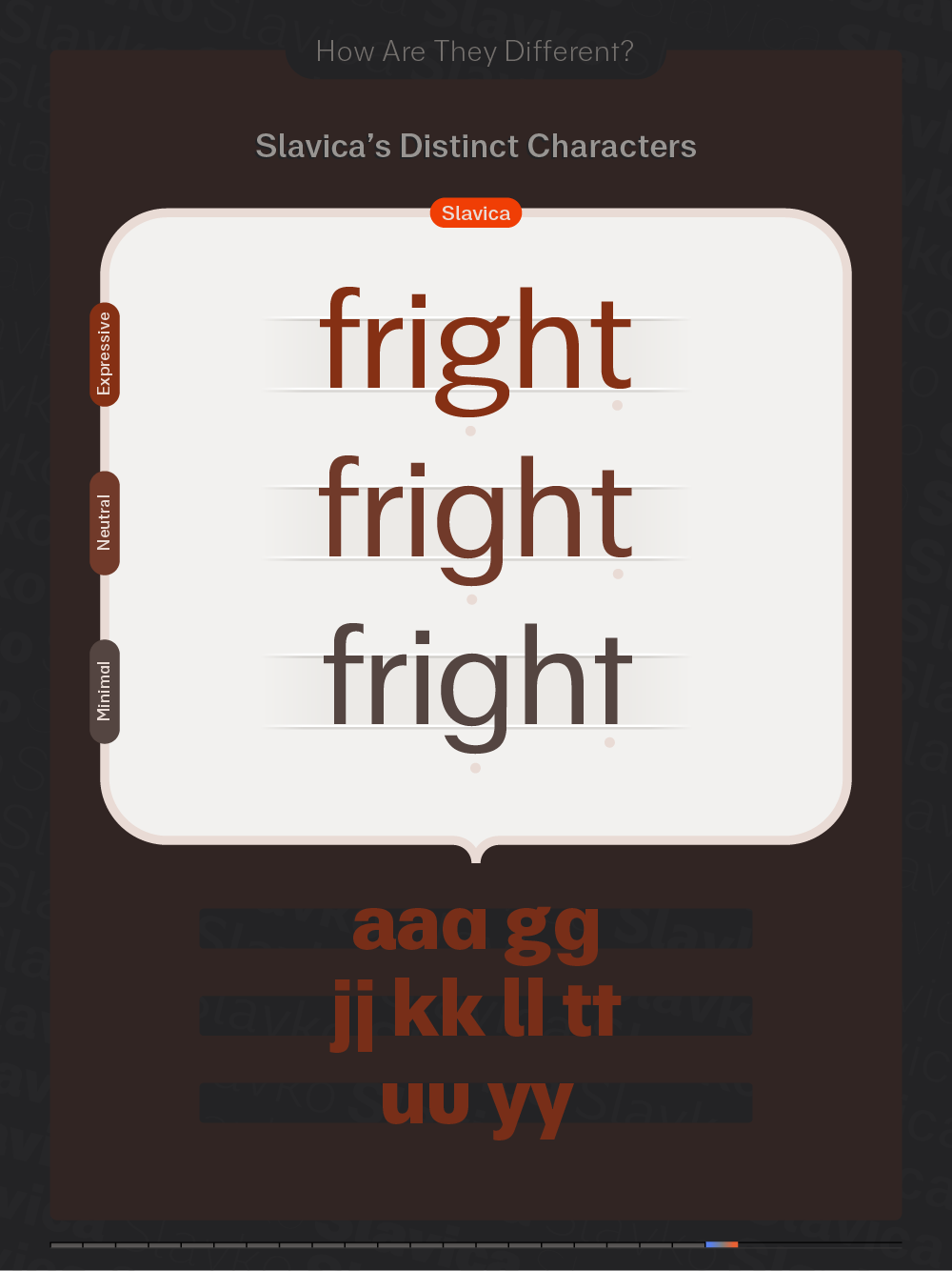
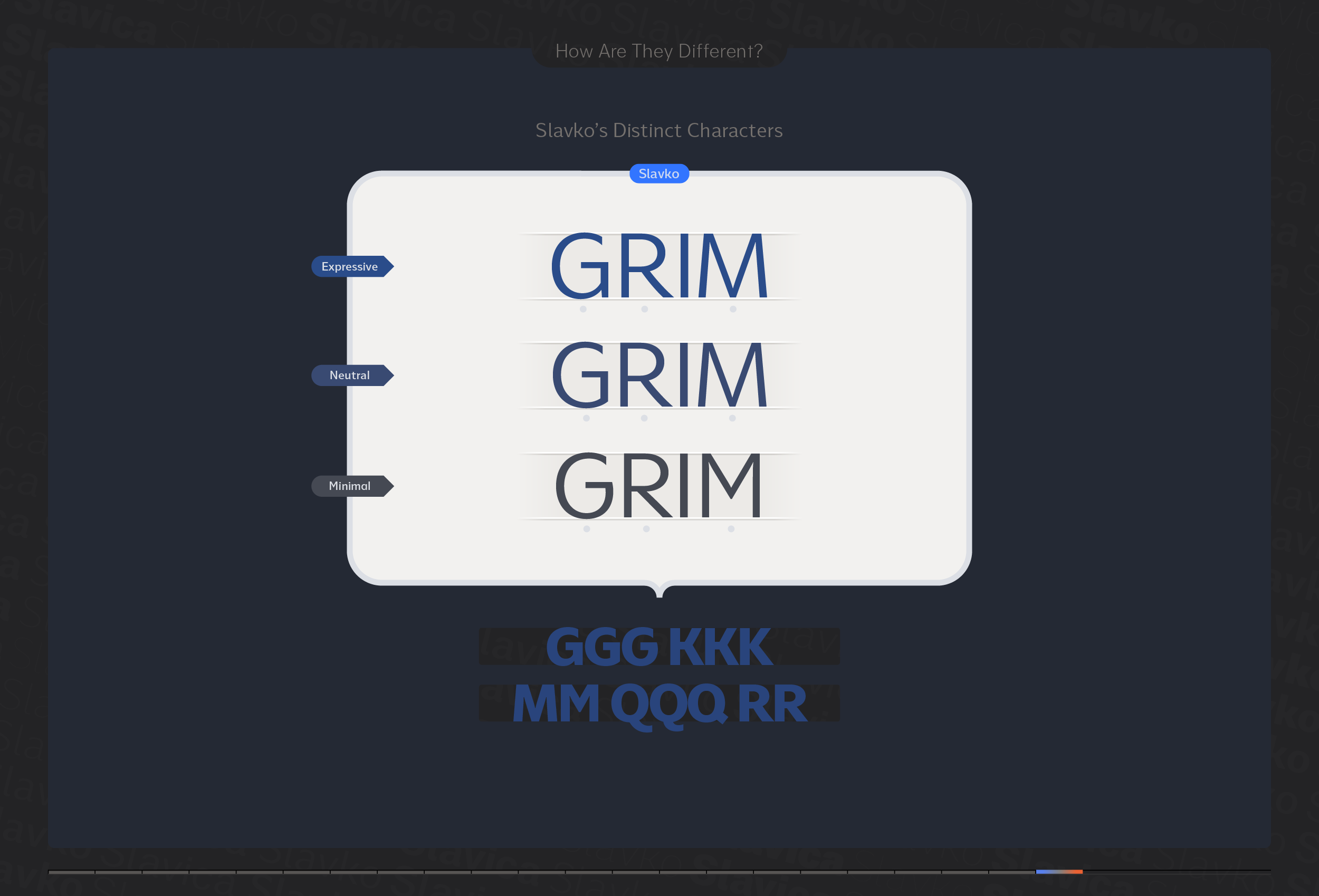
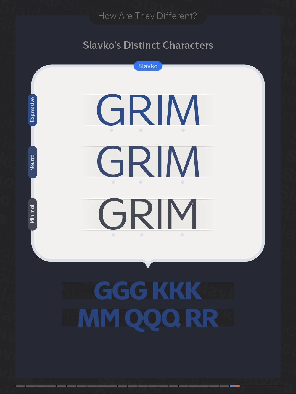
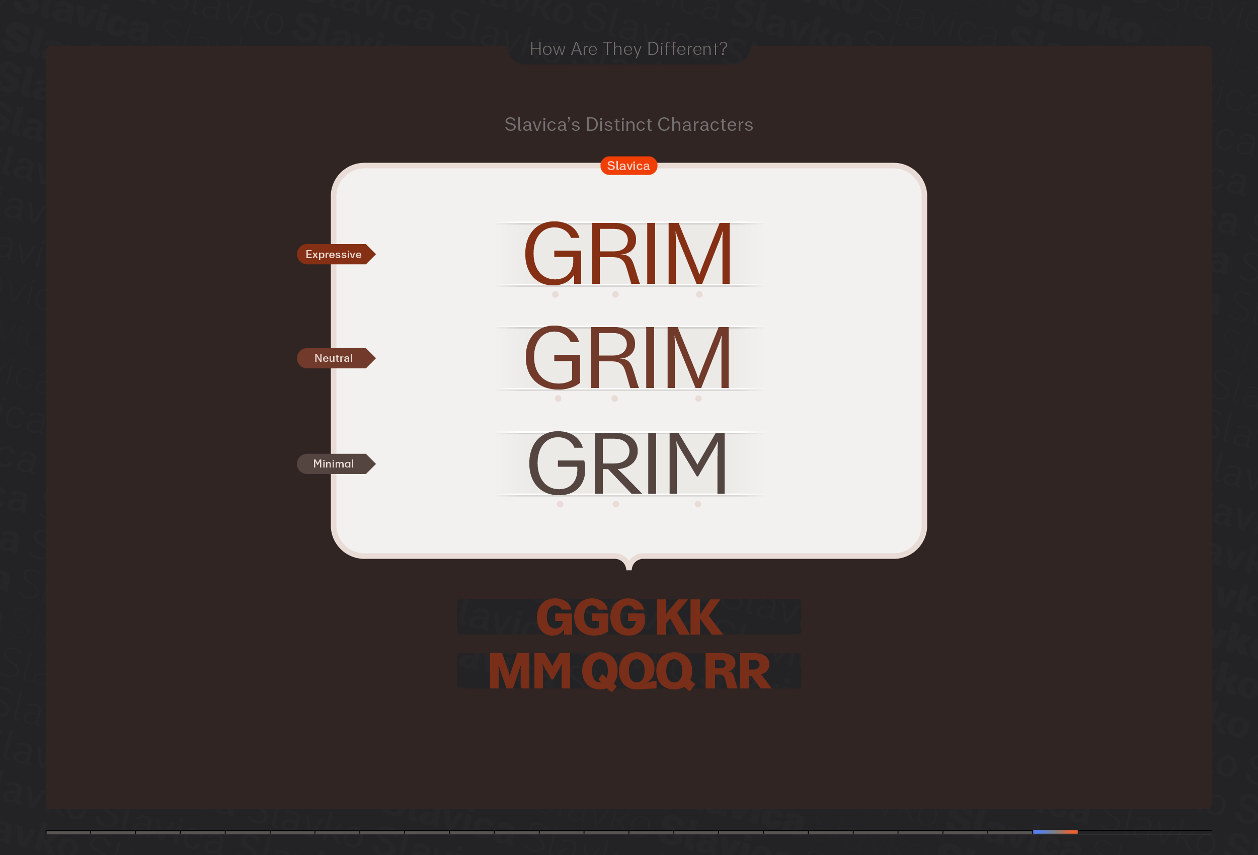
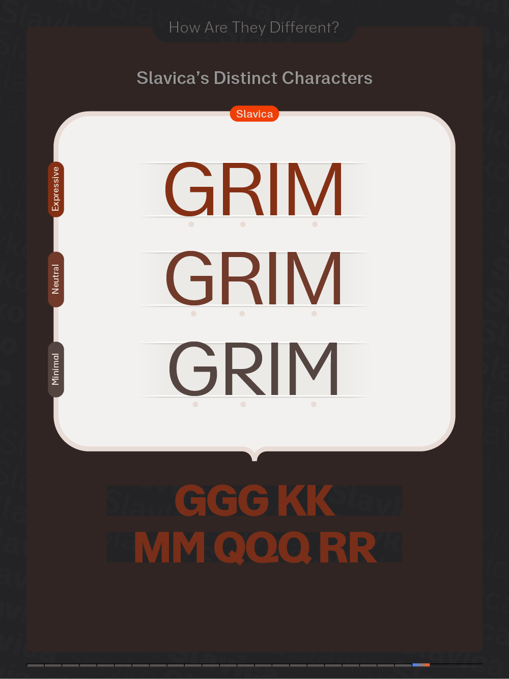
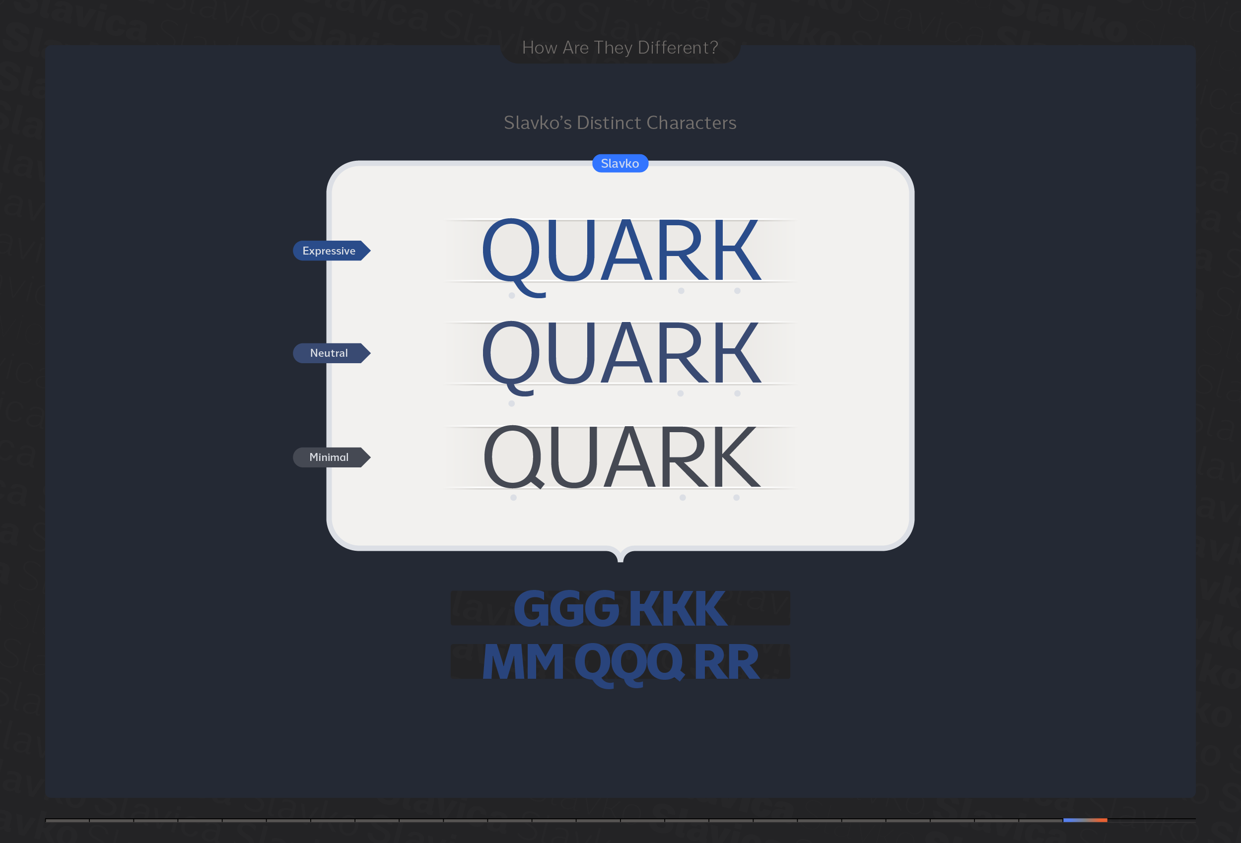
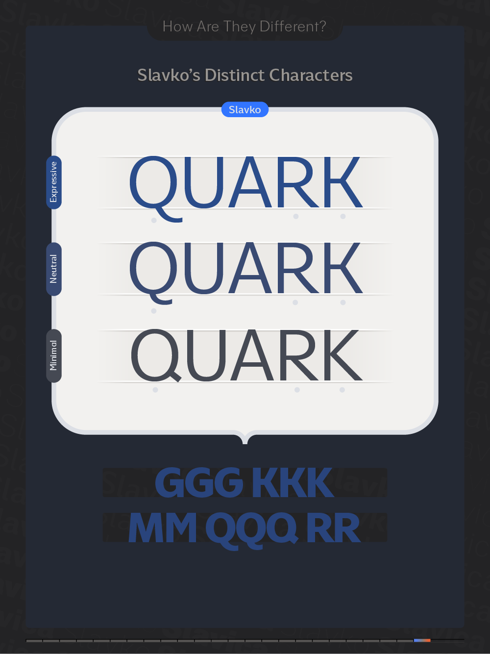
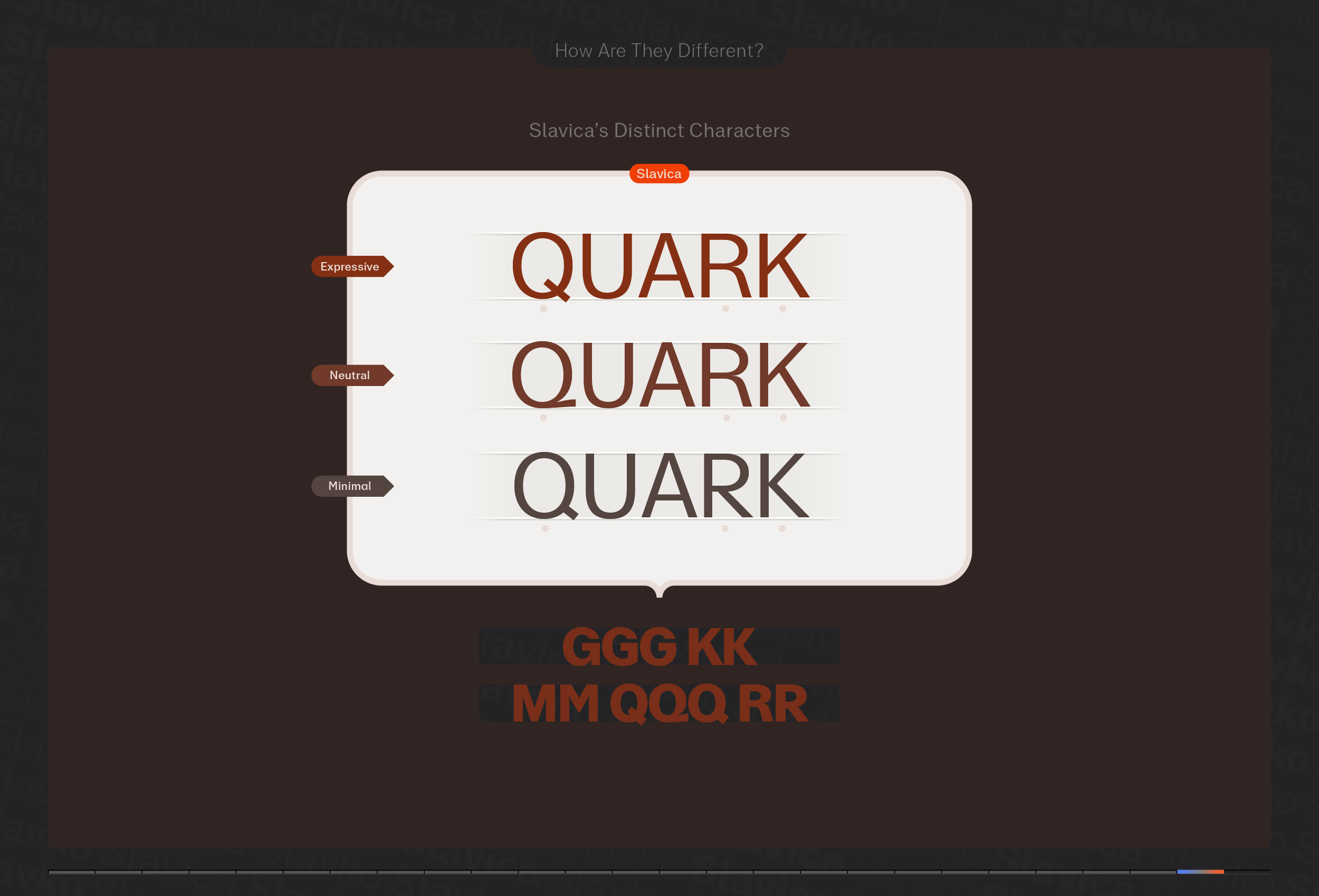
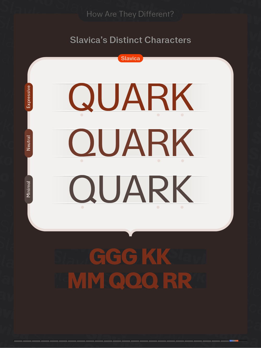
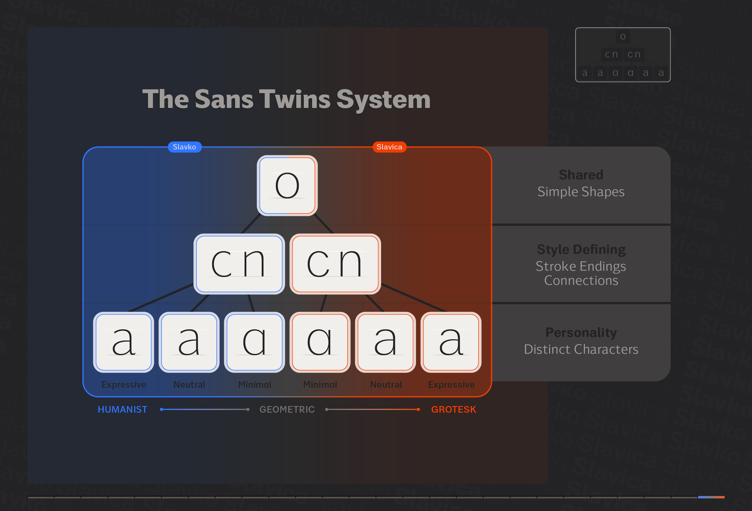
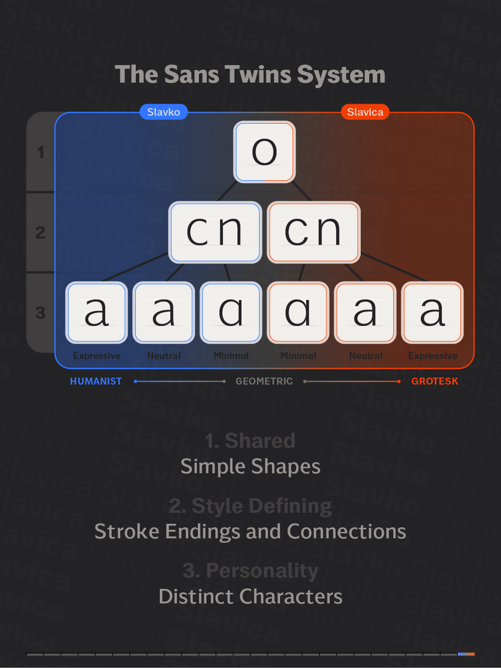
The Sans Twins are a versatile system of sans-serif fonts, featuring both Humanist (Slavko) and Neogrotesk styles (Slavica). This system leverages the linear and minimalist structure of sans-serif fonts to categorize letterforms into three groups: simple shapes, style-defining, and distinct letters. Simple shapes form the foundation of both fonts, establishing proportions and serving as building blocks for more complex forms. Style-defining lettershapes also have a basic structure, with variations defined by stroke endings (vertical or horizontal) and connections (interrupted or continuous), historically linked to Humanist and Neogrotesk styles. Distinct letters provide unique character, ranging from simple to complex forms. By changing these particular letters, the fonts can adopt three specific styles: Expressive, Neutral, or Minimal. With three stylistic sets each, the Sans Twins encompass all major sans-serif styles.
The Twins’ Dad
 📸 Urban Cerjak
Žiga Artnak, born in 1986, is a designer from Slovenia. While he has always had a fascination with letters, the inspiration for the Sans Twins emerged not from his formal education at the Academy of Fine Arts and Design in Ljubljana but instead from his graffiti background. Rather than relying solely on historical styles and their creative limitations, Artnak’s starting point was a more graphic approach to constructing letter shapes, focusing on a system of two-dimensional forms and ways of breathing life into them. This method allowed him to blend two distinct sans-serif styles into a unified and coherent system, overcoming their seemingly irreconcilable differences.
In addition to designing type, he is also a member of the graffiti-turned-art group ZEK Crew and the graphic arts collective Sreda v Sredo. He has won awards both at home and abroad for his design projects as well as his intaglio artworks.